MIMS Analysis Engine GUI User Guide - 1/15/2004
Introduction
Installation
Types of Plots
Selecting Data for Plots
Plot Options
Page Options
Introduction
The MIMS Analysis Engine provides a set of graphing tools for analyzing data.
You can select different data sets and use the different plots to
find relationships in your data. You can output these plots to a
variety of screen, file and printer formats. The main window for the graphical user interface (GUI) for the Analysis Engine is shown in Figure 1. It consists of panels for choosing data sets, editing plot options, and page options, such as saving the plot a file.
Press the Show Version button to see information about the version of the MIMS Analysis Engine you are using.
Once you have selected data sets and customized any plot and page options,
you can see the plot by pressing the View Plot button. On a PC, the plot
will appear in Adobe Acrobat. It will speed up subsequent plots to leave
Acrobat running after the first plot. You may wish to configure your Acrobat
display preferences to "Fit in window" so you can see the entire plot
without scrolling.

Figure 1. Analysis Engine Main Window
Types of Plots
There are six types of plots available. Click on the name below
to view more details about each one.
Data Sets
You must select at least one data set to produce a plot. Some plots
require more than one data set. For example, a Bar Plot only
needs
one or more data sets to produce bars along one axis, and a Scatter Plot
needs both
X and Y data sets to draw the points. Each plot tells you
how many data sets are required for it. For more
information, see the Data
Set
Selector page.
Plot Options
Each plot has a set of options listed in a table. The options vary
for each plot, but might
include a title, legend or a type of axis. You can press the Edit
button next to each option (shown in Figure 1) to edit its properties. The options for each
plot
are detailed for each plot in the Types of
Plots section. Below is a list of all plot options. Note that
many of these options are not found on all plots. For
example, the Bars option applies to a Bar Plot but does not apply to a
Scatter Plot. NOTE: if some parts of an option were not functioning properly
at the time of the release, the features were disabled. You may notice this
when you run the GUI.
Page Options
On all plot windows, there is an area called Page Options.
This allows you to specify the filename in which to
save the plot. If you wish to display your plot to the screen, you
can press the View Plot button at the bottom of the main window.
You may wish to display to the plot to the screen until you are
happy with the settings, and then save it to a file. The
Analysis Engine supports the following file formats:
There are two ways to save a plot:
- You may either type in a directory and filename and press the Save button,
or
- Press the Browse button to use a file browser to specify the directory and file name to which the file should be saved.
The type of file that the plot is saved to is determined by its file
name extension. When using the file browser to select the file,
the file type is chosen using the menu of file types. If you type in the file name, you must
use one of the the following extensions in order to save a plot to a file:
- .jpg produces a JPEG file.
- .png produces a PNG file.
- .pdf produces a PDF file.
- .ps produces a PostScript file.
- .ptx produces a LaTeX picture file.
Installation
The Analysis Engine is designed to run on both Windows and UNIX
platforms. Follow the instructions below for your operating system.
Microsoft Windows
- Install the Desktop Java Runtime Environment (version 1.3 or greater) on your computer.
- Install R on your
computer. R is a statistical package the the Analysis Engine uses to
produce graphs.
- Install Adobe PDF
Reader to view graphics in PDF format.
- Install the Analysis Engine.
UNIX / Linux
- Install the Desktop Java Runtime Environment (version 1.3 or greater) on your computer.
- Install R on your
computer. R is a statistical package the the Analysis Engine uses to
produce graphs.
- Install Adobe PDF
Reader to view graphics in PDF format.
- Install the Analysis Engine.
Data Set Selector

All plots use the same window to select the required data sets.
On the right is a list of all available data sets. When you
select one or more of the data sets on the right, you can view them
with the View Data button. To use a data set, select it in the
right hand list and press the Add to Selected button. This will
move it into the list on the left which shows the data sets that you
will be plotting. You may also double-click on a data set in the
right hand list to add it to the left hand list. If you select available
data sets then click the OK button, they will be automatically added to
the selected data sets list. To remove a data
set from the list of selected data sets, select the data set and press
the Remove button. When you have selected the necessary data
sets, press the OK button.
Bar Plot
The Bar Plot plots data in a series of bars based on the categories
that are provided. One axis plots the categories and the other axis
plot
the numeric values for each category. The images below show some
of the features of the Bar Plot.
Data Sets
A Bar Plot requires one or more data sets before it can be drawn.
Plot Options
Example plots
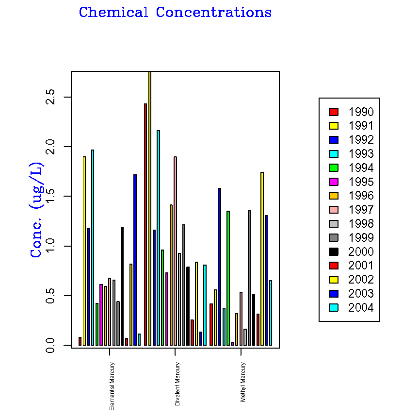
Adjacent bars
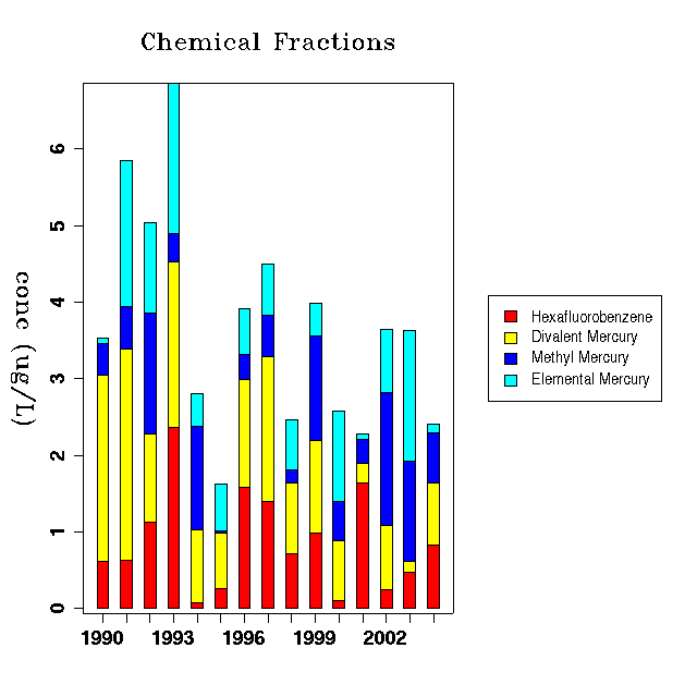
Stacked bars
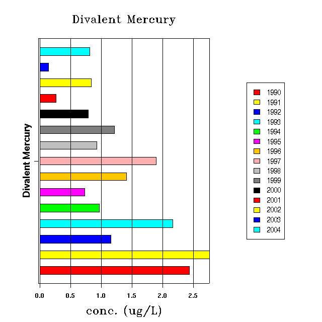
Horizontal bars
Discrete Category Plot
This plot allows you to plot different categories of data on top of
each other. This plot is useful if you would like to plot values
from different data sets that contain the same categories. Below are
some examples of how the plot might be used.
Data Sets
A Discrete Category Plot requires one or more data sets before it can
be drawn.
Plot Options
Example Plots
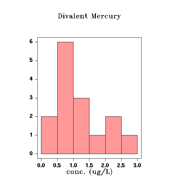
Histogram
A Histogram is a Bar Plot that shows the frequency of different values
in a data set. Use this plot to see how often your data values
fall within certain range.
Data Sets
A Histogram Plot requires exactly one, and only one data set.
Plot Options
Example Plots
Rank Order Plot
A Rank Order Plot sorts the data before plotting it. Other than that,
it behaves like a Scatter Plot.
Data Sets
A Rank Order Plot requires one or more data sets to draw a plot.
Plot Options
Example Plots
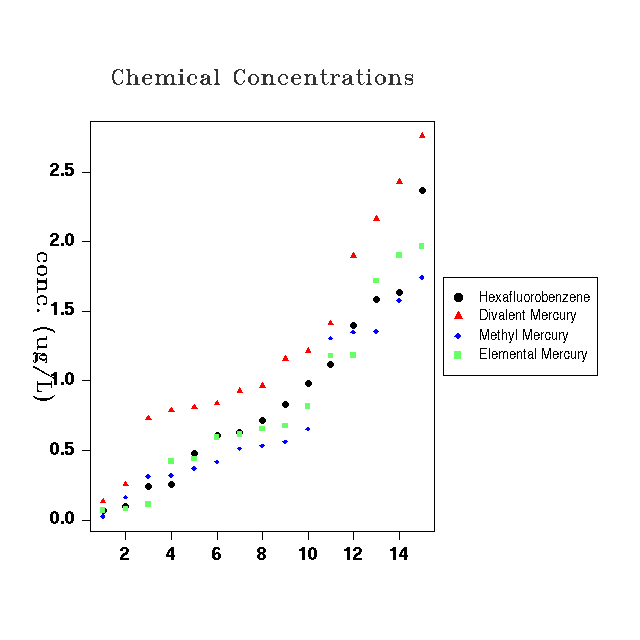
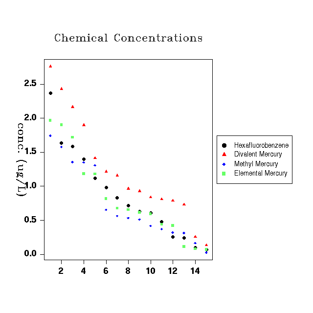
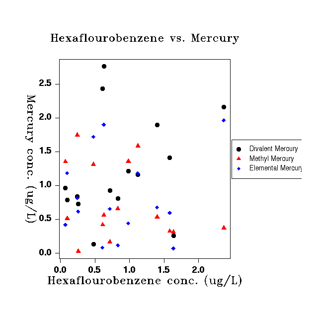
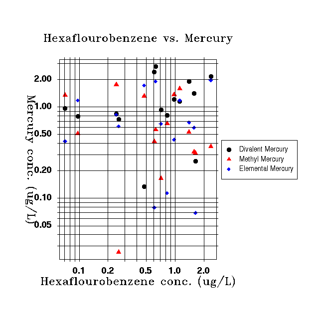
Scatter Plot
A Scatter Plot displays points and lines between an X and Y axis.
Data Sets
A Scatter Plot requires exactly one X data set and one or more Y data
sets.
Plot Options
Example Plots
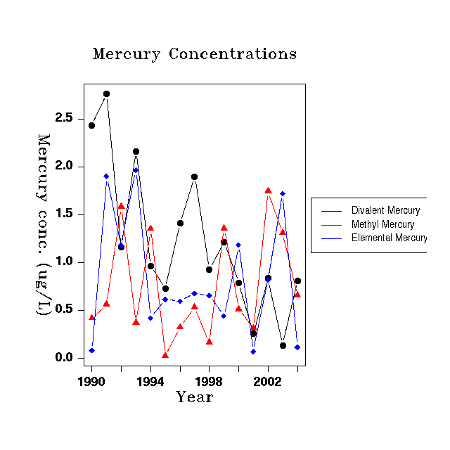
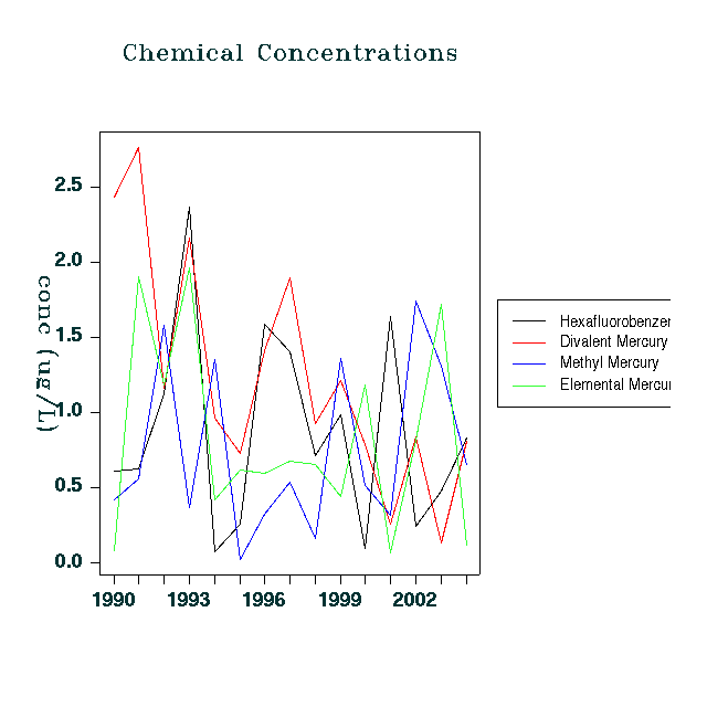
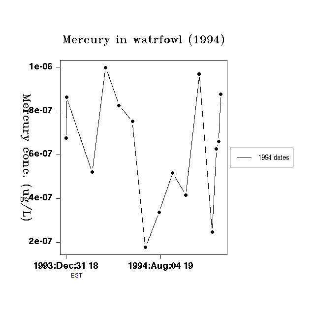
Time Series Plot
A Time Series Plot displays time along the X axis and data values along
the Y axis. Use this plot to display data that varies in time such as
air pollution data, consumer prices or stock values.
Data Sets
A Time Series Plot requires one or more time varying data sets.
Plot Options
Bars
This window allows you to set the options for how the bars are drawn are
on a bar plot.

Transpose Data?
Check this box if you would like to transpose your data from the
original order. For example, if you have on data set per chemical and
each data set contains data for several source categories, the default
view would be to show chemical names on one axis, and bars for
each source type. If you click "Transpose data?" then the items
on the axis will be the source types and there will be bars for the
chemicals.
Stacking
When multiple data sets are selected, selecting Adjacent will place the
bars next to each other.
while selecting Stacked will place values in one bar stacked on top of
each other. See the Bar Plot page for examples.
Orientation
The Vertical orientation places the bars up and down. When you choose
this orientation, the Category axis is the X axis. The Horizontal
orientation places the bars right and left. When you choose this
orientation, the Category axis is the Y axis.
Bar Colors
These are the colors used for the bars in your data set. If you have
more data than colors, then the Analysis Engine will start over at the
top of the list when choosing bar colors.
Bar Widths
You may specify different bar widths for each bar in your plot.
If you have more bars than bar widths specified, then the
Analysis Engine will start over at the beginning when assigning bar
widths. The default is to have a single bar width set to 1.0.
This is a relative size - the actual width of the bars depends on the number
of bars plotted. A value of 0.5 will cause the bars to be half as
wide as this, while a value of 2.0 will cause them to be twice as wide.
Space Between Bars
This is a relative spacing between each bar in the plot. A size of
1.0 is the default. A value of 0.5 will make the space between
bars half as large, while a value of 2.0 will set the bars twice as far apart.
Space between Categories
This is the relative spacing between categories (or groups of bars) on
the axis. This
helps to differentiate between each category. The default value
is 2.0. A value of 1.0 will place the categories half as close. A
value of 4.0 will place them twice as far apart.
Border Color
This is the color for the borders around each bar.
Category Axis
A Category Axis has a series of categories on the axis. These
might be animals in a study, types of industries, emission categories,
or age groups.

Axis
Draw Axis?
To draw the axis and any associated
grid and tick marks, check this
box. To disable all axis features for this axis, uncheck this
box.
Color
This sets the color of the axis and
tick marks.
Minimum and Maximum
Enter values here to specify the axis
minimum and maximum range. These values are in the units of the data on
the axis.
Text
This is the label that describes the
axis. It will normally appear
below or next to the axis. You may enter text and allow the
Analysis Engine to format it by typing in the text box. Press the
Edit button to edit font and positioning features of the
axis text.
Positioning Algorithm
This specifies the method that the
Analysis Engine will use to position
the axis. The default behavior is to place the X axis at the bottom of
the plot and the Y axis on the left side of the plot. Other
positioning methods are:
- Lines Into Margin: When
you select this option, you must enter a value in the Axis Position
text
box. This value is the number of lines to move the axis into the
margin.
The X axis will move down this number of lines and the Y axis
will move left this number of lines.
- User Coordinates: This
option allows you to move the axis into the plot area. When you select
this option, you must enter a value in the Axis Position text box. This
value is the coordinate on the other axis where you want this axis
drawn. For example, if you want to place the X axis at a value of 5.0
on
the Y axis instead of 0.0, enter 5.0 in the Axis Position box.
Tick Marks
Tick Marks are the small ticks that are
placed along the axis to
indicate where values lie.
Draw Tick Marks?
Check this box to draw tick marks.
Uncheck it to turn of tick mark
drawing.
Draw Tick Mark Labels?
Check this box to draw the tick mark
labels. Uncheck this to
disable all tick mark label features.
Label Color
This sets the tick mark label color.
Font Style
This sets the font style for the tick
mark labels (plain, bold, italic
or bold/italic).
Draw Tick Marks Perpendicular to Axis?
Check this box if you would like the
tick marks to appear perpendicular
to the axis. This is used on the X axis when you have long tick mark
labels or on the Y axis to set the tick mark labels horizontal.
Size
This is the size of the tick
marks in pixels.
Margin Size
The margin size allows you to set the size of the different regions of
the plot. These values interact closely with the Borders.

Enable Margin Settings
You can disable all of the Margin Size settings and allow the Analysis
Engine to use the default sizing methods by unchecking this check box.
To enable your custom setting, check this box.
Plot
The Plot is the region directly around
the plot where the axes lie.
% of Figure
When you select this option, you should
enter fractions between 0 and
1.0 that represent the percentage of the figure to use for the plot.
You must specify a percentage for all
four sides. The right and left values start with 0 at the left of
the page. So to set the plot 25% in from the left and right of the
Figure, you would enter 0.25 for the left and 0.75 for the right. The
same applies to the Top and Bottom value except that 0 indicates the
bottom.
Inches
For this option, you only need to
specify the width and height of the
plot in inches. Note that if you use this, the Figure width and
height must be set larger than the Plot width and height.
Figure
The Figure is the area around the plot
and the Legend.
% of Page
When you select this option, you can
specify the percentage of the page
to be used by the figure. You must specify a percentage for all
four sides of the figure. The right and left values start with 0 at the
left of the page. So to set the plot 25% in from the left and right of
the Page, you would enter 0.25 for the left and 0.75 for the right. The
same applies to the Top and Bottom value except that 0 indicates the
bottom.
Inches
When you select this option, you can
specify the figure width and
height in inches. Note that you must set the Figure width and height to
be larger than the plot width and height.
Margin
The Margin is the edge of the page.
% of Screen
When you select this option, you can
enter the percentage of the page
to use for the margin. These values differ from the percentage
values in the Figure and Plot sections. These percentages all
start from the edge of the page. So, if you want an amount equal
to 20 percent of the size of the paper to on each side, enter 0.2 in all
of the fields.
Inches
When you select this option, enter
the number of inches from the
side that you would like the margin to appear.
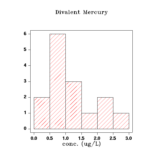
Histogram
This window allows you to set the options for a Histogram plot.

Solid / Shaded
The bars can be either solidly filled or shaded with lines. Choose
Solid for solid shading and Shaded for spaced lines.
Shading Angle
This option is only valid when the Shaded option is selected.
This is an angle between 0 and 90 degrees which is the angle at
which you would like the shaded lines in the bars drawn.
Shading Density
This option is only valid when the Shaded option is selected.
This
is the number of lines per inch that you would like to fill the shaded
bars.
Bar Color
This is the color of the bar shading.
Border Color
This is the color for the border around the bars.
Border Line Style
This is the style for the lines that are drawn around the border. There
are six styles to choose from.
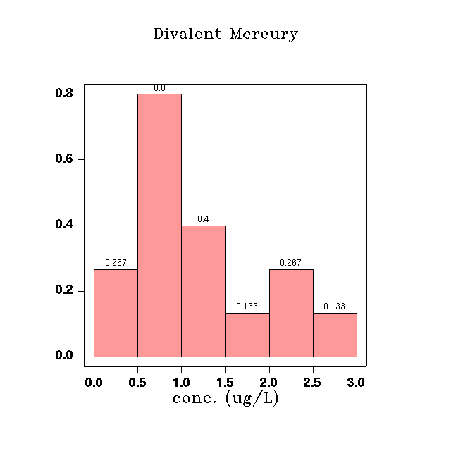
Bar Labeling
Show Values Above Bars?
Check this box if you would like the
values for each histogram bar
plotted above each bar.
Values Indicate Frequency
This option is only available when the
Show Values Above Bars box is
checked. If you would like the values to show the number of items in
each bin, check this box.
Values Indicate Probability
This option is only available when the
Show Values Above Bars box is
checked. If you would like the values to show the percentage of items
in
each bin, check this box.
X Value Range
This allows you to specify a range on the X axis where the histogram
will be plotted.
Breaks
This table allows you to set up custom break points for each bin in the
histogram. You must enter bins such that all of your data is covered.
For example, if you have data than ranges between 0 and 3.0, you
must enter bins that include this range. If you only enter bins from
1.0
to 2.0, the Histogram will not plot.
Closure
Include Lowest
Legend
The Legend explains which data sets the different lines and points on
the plot refer to.

Orientation
A value of Vertical means that the values in the Legend will be
displayed in one column. A value of Horizontal means that the values
will be in one row.
Background Color
This is the colors to place behind the Legend.
Number of Columns
This Option is only valid if the Vertical Orientation is selected.
Enter an integer that is the number of columns you would like to see in
the Legend.
Position
Margin
The Legend can be placed on any of the
four sides of the plot (right,
left, top or bottom). The default is the right margin area.
Alignment
The horizontal and vertical alignment
can vary between
0.0 and 1.0. They indicate where
on the side of the plot the Legend should be drawn. A horizontal
value of
0.0 indicates the left side of the margin. A vertical value of
0.0
indicates the bottom of the margin.
Character
Size
This is the relative size of the
characters in the margin. A value if
1.0 is th default. A value of 0.5 will make the text half as
large. A value of 2.0 will make the text twice as large.
Horizontal Spacing
This is the amount of horizontal space between the words in the Legend.
Vertical Spacing
This is the amount of vertical space between the words in the
Legend.
Line Type
The Line Type is used to set the properties (width, style, color, etc.)
for the lines and symbols used to draw data on the plot. To edit any of
the values in the table, double-click on the value. In some cases, you
can edit the value in place and in others, a dialog will appear that
allows you to edit the value.

Draw Points and Lines
If you only wish to use points in your plot, check only the Draw Points
check box. If you only wish to use lines in your plot, check the Draw
Lines check box. If you wish to use both points and line in you plot,
then check both the Draw Lines and Draw Points check boxes.
Symbol
There are 19 different symbols available to differentiate each data set
on the plot. Select one for each data set from the drop down list in
the
table. If you have more data sets than symbols defined, then the
Analysis Engine will start to reuse the same symbols over when it
gets to the end of the defined symbols. If you wish to add more unique
line styles, click one of the two leftmost icons in the toolbar above the
table.
Size
This is the relative size of the symbol. A value of 1.0 is the
default. A value of 0.5 would be half as large. A value of 2.0
would be twice as large.
Line Style
This is the style to use when drawing the line for each data set.
There are 6 available line styles. If you have more than
six
data sets, the Analysis Engine will start over with the first line
style and continue down the list when choosing line styles for the data
sets.
Width
This is the relative width of the lines. A value of 1.0 is
the default. A value of 0.5 would be half as large. A value of
2.0
would be twice as large.
Color
This is the color for the points and line of this data set. If
you have more data sets than colors defined, then the Analysis Engine
will start at the top of the list and use the colors cyclically to
choose colors for the data sets.
Numeric Axis
A Numeric axis is one which plots values as numbers. This is different
from a Time Series axis and a Category axis. A log scale, grid and
custom tick mark spacing are available on this axis.

Axis
Draw Axis?
To draw the axis and any associated
grid and tick marks, check this
box. To disable all axis features for this axis, uncheck this box.
Log Scale?
To plot this axis using a log scale,
check this box.
Color
This sets the color of the axis and
tick marks.
Reference Lines
Reference lines allow you to place
lines on the plot at places that you
specify. You could use them to indicate a trend line or upper and lower
control limits in your plot. Reference lines have their own
dialog
and are covered
here.
Minimum and Maximum
Enter values here to specify the axis
minimum and maximum range. These are in the data coordinates of
the axis.
Text
This is the label that describes the
axis. It will normally appear
below or next to the axis. You may enter text and allow the
Analysis Engine to format it by typing in the text box. Press the
Edit button to edit font and positioning features of the
axis text.
Positioning Algorithm
This specifies the method that the
Analysis Engine will use to position
the axis. The default behavior is to place the X axis at the bottom of
the plot and the Y axis on the left side of the plot. Other
positioning methods are:
- Lines Into Margin: When
you select this option, you must enter a value in the Axis Position
text
box. This value is the number of lines to move the axis into the
margin. The X axis will move down this number of lines and the Y
axis will move left this number of lines.
- User Coordinates: This
option allows you to move the axis into the plot area. When you select
this option, you must enter a value in the Axis Position text box. This
value is the coordinate on the other axis where you want this axis
drawn. For example, if you want to place the X axis at a value of 5.0
on
the Y axis instead of 0.0, enter 5.0 in the Axis Position box.
Grid
The grid is a set of lines that are
drawn all the way across the plot.
They allow you to read you data values from the plot more accurately.
Draw Grid?
To draw the grid, check this box. To
turn off all grid drawing, uncheck
this box.
Color
The color to use for the grid lines.
Line Style
The type of line to use for the grid
lines. There are seven line styles
including a blank line.
Enable Grid Tick Marks?
This feature only works with the Log
Scale enabled. Set the Grid
Line Style to a blank line to see this feature. It will draw tick marks
facing into the plot along the axis at each grid point.
Grid Tick Mark Length
This is the relative length of the grid
tick marks. The default size is
1.0. A value of 0.5 makes a line half as long. A value of 2.0
makes a line twice as long.
Grid Bounds
This defines where the grid starts and
stops. You can choose to
draw the grid only on part of the axis.
Default
The default behavior is to draw the
grid all of the way across the axis.
Increment
With the Increment method for grid
spacing, you must specify an Initial
Point in the coordinates of the axis. Then you must specify an
Increment
in the coordinates of the axis. You may optionally choose to specify a
Final Point where grid drawing should stop. For example, to draw
a grid from 1.0 to 2.0 with a grid line at each 0.1 mark, enter 1.0 for
the Initial Point, 2.0 for the Final Point and 0.1 for the Increment.
Divisions
With the Divisions method of grid
spacing, you must enter an Initial and
Final Point where the grid will start and stop. In addition, you must
specify the number of divisions (as an integer) to place between the
Initial and Final Point. For example, if you wish to draw a grid
between
1.0 and 2.0 with 10 evenly spaced divisions, enter 1.0 for the Initial
point, 2.0 for the Final Point and 10 for the Divisions.
Tick Marks
Tick Marks are the small ticks that are
placed along the axis to
indicate where values lie.
Draw Tick Marks?
Check this box to draw tick marks.
Uncheck it to turn of tick mark
drawing.
Draw Tick Mark Labels?
Check this box to draw the tick mark
labels. Uncheck this to
disable all tick mark label features.
Label Color
This sets the tick mark label color.
Font Style
This sets the font style for the tick
mark labels (plain, bold, italic
or bold/italic).
Draw Tick Marks Perpendicular to Axis?
Check this box if you would like the
tick marks to appear perpendicular
to the axis. This is used on the X axis when you have long tick mark
labels or on the Y axis to set the tick mark labels horizontal.
Size
This is the relative of the tick
marks in pixels.
Custom Tick Marks
Custom Tick Marks allow you to set
values and labels on the axis
wherever you choose. They will override the default tick marks.

To use them, press the Edit Custom Tick Marks button. This will
bring up a separate dialog window. On the left is a table where
you can enter the tick mark labels. On the right is a table where
you specify the positions on the axis where the tick marks should be
drawn. To add a line to the table, press the Insert Row button.
You must add the same number of lines to both the left and right
tables.
Borders
The Borders window allows you to place borders around different objects
in the
plot. There are four areas that can have different borders; the plot,
the figure, the inner margin and the outer margin. These interact
closely with the Margin Size options.

Position
There are four areas that around which borders can be placed. The
Plot itself can have a border. This border runs only around the
plot where the axes area. The Figure border lies around the plot and
the Legend. The inner border is just inside of the edge of the
page and the outer border is at the very edge of the page.
Draw?
If you wish to draw any of the borders, check the draw check box
next
to the item.
Line Style
This is the style of line to use for this border. There are seven
different styles to choose from, including a blank line.
Color
This is the color of the border.
Line Width
This is the width to use for the border line in pixels.
Reference Lines
Reference Lines allow you to place lines on the plot at specific
locations to mark important values. You could use these to
mark control limits or to indicate a trend line for a set of data.

Enable Reference Lines
You may turn off all reference lines by unchecking the Enable Ref Lines
box at the top of the plot.
Creating a Reference Line
Press the Insert Row button on the left side of the tool bar to insert
a row. Then double click on each cell to edit it.
Label
This is the text that you would like to
display with the reference
line. It is not required and you may leave it blank. If you choose to
edit it, you have a wide variety of choices in controlling the
properties of the displayed text. Click
here to see the options.
LineSytle
This is the style for the reference line. There are six styles from
which to choose.
Width
This is the relative line width for the reference line. The
default value is 1.0. A value of 0.5 will make the line half as
wide. A value of 2.0 will make the line twice as wide.
Color
This is the color for the reference line.
Enable
Check this box if you would like to draw this reference line. Uncheck
it if you would like remember the line, but do not want to draw it on
the current plot.
Positioning the Reference Line
There are two ways to specify where the
reference line should be
positioned and how long it should be. You may specify a slope and
point or specify two points.
Slope and Point Method
Specify a point by entering in values
in the x1 and y1 columns of the table. Specify a
slope by entering in a value in the m
column. The values that you enter must be in the coordinates of
the plot. This will draw a line all of the way across the plot.
Use "Infinity" for the slope to draw a vertical line. For example, to
draw a vertical line at x = 2.0, enter '2.0' in the x1 column, '0.0' in
the y1 column and 'Infinity' in the slope column. Use a slope of
0 to draw a horizontal line. For example, to draw a vertical line
at y = 1.0, enter '0.0' in the x1 column, '1.0' in the y1 column and
'0.0' in the slope column.
Two Points Method
This method is useful if you only want
to draw a line across part of
the plot. Specify one point but entering values in the x1 and y1 columns. Specify the second
point by entering values in the x2
and y2 columns. For
example, to draw a line from (1.0, 1.0) to (4.0, 4.0), enter '1.0' in
the x1 column, enter '1.0' in the y1 column, enter '4.0' in the x2
column and enter '4.0' in the y2 column.
Sorting
The Sorting window allows you to set the options for how your data is
sorted.

Sort Values?
Check this box to sort your data before plotting. Uncheck it to
turn off all sorting.
Ascending / Descending
This specifies the order in which the data should be sorted.
Missing Data
If you are plotting several data sets and one of them is shorter than
the others, this option allows you to place the "missing" data at the
beginning or end of the plot.
Text
The Text window is used to set the text properties for the Plot Title,
Subtitle, Footer and the text on Axes.
The Plot Title appears above the plot. The Plot Subtitle appears
just below the Title. The Plot Footer is displayed below the
plot. Axis text describes the axis with which is is associated
and is drawn next to the axis.

Text
This is the text value to display.
Style
This is the font style (plain, bold or italic) to use for the text.
Typeface
This is the font to use for the text.
Color
This is the color to use for the text.
Size
This is the relative size to use for the text. A value of
1.0 produces the default size. 0.5 will produce text half as large and
2.0 will produce text twice as large.
Rotation
The rotation is a value in degrees by which the text will be
rotated. The value may be between -180 and 180 degrees.
Positioning
Absolute
When you select the Absolute
positioning button, you should enter X and
Y coordinates for where the title should appear. These
coordinates
are in the same units a your data. For example, if your Y axis runs
from 0 to 3, then 0 would position the text on the same line as the
'0' tick mark and 3 would position the text on the same line as
the '3' tick mark.
Grid
When you select the Grid positioning
button, you should enter a sector
and horizontal and vertical alignment values. The sector is a set
of compass
values (North, South, East, West, etc.) and a center value. These
are sectors in different areas for the Title, Subtitle, Footer, Axis
and Reference Line.
- Title : The sectors are at the top of the screen above the plot.
- Subtitle : The sectors are above the plot, but below the Title
text.
- Footer : The sectors are at the bottom of the screen below the
plot.
- Axis : The sectors are below the X axis and to the left of the Y
axis.
The X and
Y alignment values can be between 0 and 1.0 and indicate where the text
should be placed within the chosen sector. For example, if you chose an
horizontal alignment value of 0, the text would be placed to the left.
If you
chose 1.0, the text would be placed to the right. For vertical
alignment values, 0
indicates the lower part of the sector and 1.0 indicates the top of the
sector.
Text with Border
The Text window is used to set the text properties for the Plot Title,
Subtitle, Footer and the text on Axes.
The Plot Title appears above the plot. The Plot Subtitle appears
just below the Title. The Plot Footer is displayed below the
plot. Axis text describes the axis with which is is associated
and is drawn next to the axis.

Text
This is the text value to display.
Style
This is the font style (plain, bold or italic) to use for the text.
Typeface
This is the font to use for the text.
Color
This is the color to use for the text.
Size
This is the relative size to use for the text. A value of
1.0 produces the default size. 0.5 will produce text half as large and
2.0 will produce text twice as large.
Rotation
The rotation is a value in degrees by which the text will be
rotated. The value may be between -180 and 180 degrees.
Positioning
Absolute
When you select the Absolute
positioning button, you should enter X and
Y coordinates for where the title should appear. These
coordinates
are in the same units a your data. For example, if your Y axis runs
from 0 to 3, then 0 would position the text on the same line as the
'0' tick mark and 3 would position the text on the same line as
the '3' tick mark.
Grid
When you select the Grid positioning
button, you should enter a sector
and X and Y alignment values. The sector is a set of compass
values (North, South, East, West, etc.) and a center value. These
are sectors in different areas for the Title, Subtitle, Footer, Axis
and Reference Line.
- Title : The sectors are at the top of the screen above the plot.
- Subtitle : The sectors are above the plot, but below the Title
text.
- Footer : The sectors are at the bottom of the screen below the
plot.
- Axis : The sectors are below the X axis and to the left of the Y
axis.
The X and
Y alignment values can be between 0 and 1.0 and indicate where the text
should be placed within the chosen sector. For example, if you chose an
X alignment value of 0, the text would be placed to the left. If you
chose 1.0, the text would be placed to the right. For Y values, 0
indicates the lower part of the sector and 1.0 indicates the top of the
sector.
Border
Draw?
Check this box if you would like a
border drawn around the text.
LineStyle
This is the style of line that will be
used to draw the border around
the text.
Line Width
This is a relative line width that will
be used to draw the border
around the text. The default value is 1.0. A value of 0.5
will make the line half as wide. A value of 2.0 will make the
line twice as wide.
Line Color
This is the color of the border that
will be drawn around the text.
Background
This is the background color that will
appear behind the text.
Border Padding
These four values (Left, Right, Top,
Bottom) indicate how much space
should appear between the text and the border. Increase the values to
create more space around the text.
Time Series Axis
The Time Series Axis displays only time values.

Time Format
This is the format in which all time values must be entered into this
window. It is also the format that will be used in the plot itself. Set
this first before entering values into this window.
Axis
Draw Axis?
To draw the axis and any associated
grid and tick marks, check this
box. To disable all axis features for this axis, uncheck this
box.
Color
This sets the color of the axis and
tick marks.
Minimum and Maximum
Enter time values here to specify the
axis minimum and maximum range. These must be in the same format as the
Time Format at the top of the screen.
Text
This is the label that describes the
axis. It will normally appear
below or next to the axis. You may enter text and allow the
Analysis Engine to format it by typing in the text box. Press the
Edit button to edit font and positioning features of the
axis
text.
Positioning Algorithm
This specifies the method that the
Analysis Engine will use to position
the axis. The default behavior is to place the X axis at the bottom of
the plot and the Y axis on the left side of the plot. Other
positioning methods are:
- Lines Into Margin: When
you select this option, you must enter a value in the Axis Position
text
box. This value is the number of lines to move the axis into the
margin. The X axis will move down this number of lines and the Y
axis will move left this number of lines.
- User Coordinates: This
option allows you to move the axis into the plot area. When you select
this option, you must enter a value in the Axis Position text box. This
value is the coordinate on the other axis where you want this axis
drawn. For example, if you want to place the X axis at a value of 5.0
on
the Y axis instead of 0.0, enter 5.0 in the Axis Position box.
Grid
The grid is a set of lines that are
drawn all the way across the plot.
They allow you to read you data values from the plot more accurately.
Draw Grid?
To draw the grid, check this box. To
turn off all grid drawing, uncheck
this box.
Color
The color to use for the grid lines.
Line Style
The type of line to use for the grid
lines. There are seven line styles
including a blank line.
Enable Grid Tick Marks?
This feature only works with the Log
Scale enabled. Set the Grid
Line Style to a blank line to see this feature. It will draw tick marks
facing into the plot along the axis at each grid point.
Grid Tick Mark Length
This is the relative length of the grid
tick marks. The default size is
1.0. A value of 0.5 makes a line half as long. A value of 2.0
makes a line twice as long.
Grid Bounds
This defines where the grid starts and
stops. You can choose to
draw the grid only on part of the axis.
Default
The default behavior is to draw the
grid all of the way across the axis.
Increment
With the Increment method for grid
spacing, you must specify an Initial
Point in the coordinates of the axis. Then you must specify an
Increment
in hours. You may optionally choose to specify a Final Point where grid
drawing should stop. For example, to draw a grid from Jan. 1,
1990 to Jan. 5, 1990 with a grid line at each day mark, enter
01/01/1990 for the Initial Point, 01/05/1990 for the Final Point and 24
for the Increment.
Divisions
With the Divisions method of grid
spacing, you must enter an Initial and
Final Point where the grid will start and stop. In addition, you must
specify the number of divisions (as an integer) to place between the
Initial and Final Point. For example, if you wish to draw a grid
between Jan. 1, 1990 and Jan. 5, 1990 with 10 evenly spaced
divisions, enter 1.0 for the Initial point, 2.0 for the Final Point and
10 for the Divisions.
Tick Marks
Tick Marks are the small ticks that are
placed along the axis to
indicate where values lie.
Draw Tick Marks?
Check this box to draw tick marks.
Uncheck it to turn of tick mark
drawing.
Draw Tick Mark Labels?
Check this box to draw the tick mark
labels. Uncheck this to
disable all tick mark label features.
Label Color
This sets the tick mark label color.
Font Style
This sets the font style for the tick
mark labels (plain, bold, italic
or bold/italic).
Draw Tick Marks Perpendicular to Axis?
Check this box if you would like the
tick marks to appear perpendicular
to the axis. This is used on the X axis when you have long tick mark
labels or on the Y axis to set the tick mark labels horizontal.
Size
This is the width of the tick
marks in pixels.


