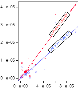
![]()
The Plot function can create a graph of the data using the R statistical package. The Analysis Engine can create plots of the information in the data tables. Ten types of plots are currently available:
|
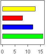
Bar
|
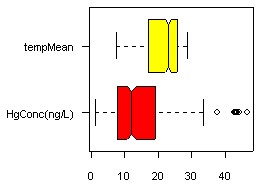
Box (Box and Whiskers)
|
|
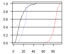
Cumulative Distribution Function (CDF)
|
Discrete Category
|
|
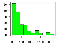
Histogram
|
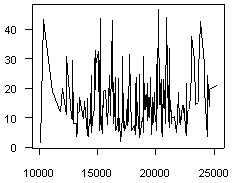
Line
|
|
Rank Order
|
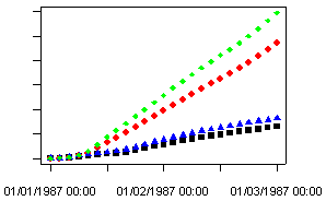
Time Series
|
|
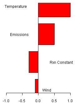
Tornado
|
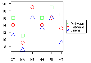
XY (Scatter)
|
When the Plot
(![]() ) toolbar button is clicked from the Data Table Window,
the Select Plotting Options window
appears:
) toolbar button is clicked from the Data Table Window,
the Select Plotting Options window
appears:
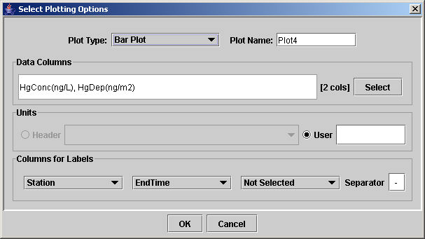
You may plot the data that is currently displayed on the tab (and does not include rows that have been filtered from the display). First choose the appropriate plot type in the Plot Type field using the pull down menu on the Select Plotting Options window. Next type a name for the plot configuration in the Plot Name field. After a plot is created, the plot name will appear when you view the Analysis Configuration.
The field in the Data Columns group box shows the titles of the columns that have been selected for plotting. Click on the Select button to choose which columns might be included in the plotting.
You may select the header rows or type "Units" into the User field, and the units will appear as the default axis label for the plot's numeric axis. The text can be changed by altering the Numeric Axis text from the plotting engine interface.
For many types of plots, you may also specify which columns should be used to produce the tick mark labels or a legend for the plot. To specify which columns should provide the labels, click on the Station pulldown menu in the Columns for Labels group box. When the labels cannot be specified, the label selections box elements will be grayed out. Use the EndTime and Not Selected pull down menus to include text from additional columns in the label. If multiple columns are combined to form a label, the Separator field indicates the single character that should be placed between the pieces of text as they appear in the legend. For example, to place an underscore between a date and time (e.g., "01/02/2003_04:05"), set the date and time columns for the label and type the underscore in the Separator field.
Click OK when all of the appropriate values have been selected from the Select Plotting Options window to save the action and close the Select Plotting Actions window. Then you need to specify the Plot Parameters.