| Home | State & Local Events | Asthma & Air Quality | Air Quality Around the World | Air Quality Trends | Citizen Science |
Air Quality Trends |
You check the AQI every day to find out if today will be an unhealthy air quality day. But do you ever wonder if the number of unhealthy days is going up? -- going down? -- staying the same? Here’s one way to look at it. For 35 metropolitan areas across the U.S., this graphic shows the total number of unhealthy days for ozone and fine particle pollution since the year 2000. The trend definitely shows improvement! Fewer unhealthy air quality days means better health, longevity, and quality of life for all of us. 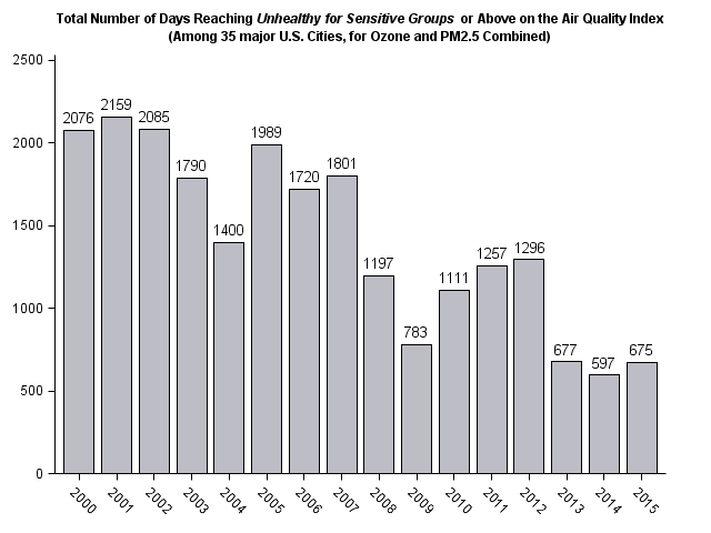 See separate graphics for ozone and PM2.5.For more on the air quality trends in each of the 35 major cities, check out the 2015 Story Map for Ozone, 2015 Story Map for PM2.5 and the 2015 Combined Story Map.Go to epa.gov/airtrends to see air quality trends where you live. Don’t forget to check the AQI forecast each day to see what to expect for your air quality. You can find your AQI forecast at www.airnow.gov. AirNow also has a smartphone app, a website widget, and a sign-up for EnviroFlash emails. All of these will give you the AQI forecast. For additional information on air quality forecasts, The National Oceanic and Atmospheric Administration (NOAA) provides an Air Quality Forecast Guidance. |
 |