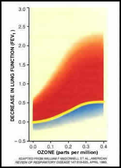
response to ozone exposure.
Source: Devlin et al. (1997)
Source: Devlin et al. (1997)
| Print Window | Close Window | |
|
|
|
| Figure 6: Variability of response to ozone exposure. Source: Devlin et al. (1997) |
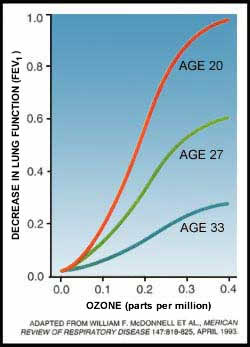
Figure 7: Sensitivity to ozone exposure
is age related. Source: Devlin et al. (1997) |