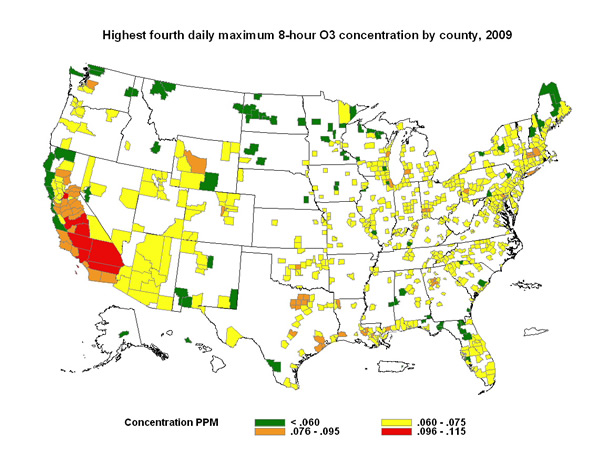
 Figure 1: U.S. counties with high ozone concentrations in 2009.
This map depicts ozone concentrations by U.S. county for 2009, showing
where high ambient ozone concentrations were found in the continental
United States. The map's color key is based on the categories of the
Air Quality Index (AQI) (see
Patient Exposure and
the Air Quality Index ). All orange, red, and purple areas exceeded
the 8-hour ambient air quality standard for ozone during 2009. The map
illustrates how likely it may be for a particular area to experience
air quality advisories for ozone.