An arrow represents a pointer from a text box to a plot feature of interest. When you select the Arrows tab from the Text Box editor, a table initially appears. The table lists a number for the arrow, shows the associated starting position for the arrow, and has a check box to indicate whether or not the arrow should appear. To add new arrows, delete old ones, or rearrange the existing arrows, use the special Table Icons above the list. In the plot, arrows further down the list will cover those higher in the list.
After the correct number of arrows have been created, double-click the mouse in the Arrow column on the spot that lists the starting position of the arrow. A new dialog box will appear that allows you to specify all of the characteristics of the arrow:
Arrow Starting Position
Specify the starting position of the arrow by selecting the position through the Units, X, and Y parameters. The Backoff property can be used to set the real starting position of the arrow a short distance away (toward the text box) from the one specified by the X and Y properties.
Arrow Specifications
The following choices must be made:
Head Type: Point arrowhead away from text box, toward text box, or in both directions (double headed)
Attached to Box: the side/corner of the text box to attach the arrow end position (East, South, West, North, North East, South East, South West, or North West)
Length: relative length of the segments in the arrowhead (default = 0.5)
Angle: number of degrees for the angle between the arrow and the arrowhead segments (default = 30)
This is the color to fill the text box or legend box. Click the Background Color icon to present a dialog box that allows you to choose the color three different ways. Click on the Swatch tab to pick a color from a chart directly, click on the HSB tab to specify the hue, saturation, and brightness, or click on the RGB tab to indicate the levels of red, green, and blue to be used in the color. Click OK to pick this color, Cancel to keep the previously selected color, or Reset to change the color back to the previously selected color.
The table of Bar Colors initially shows 20 different colors that can be used to color each of the bar series in a Bar Plot. The table of Box Colors initially shows 11 different colors that will be used to color each of the bar series in a Box Plot. You may double-click the mouse on the color bar to adjust the color. A dialog box is presented that allows you to choose the color three different ways. Click on the Swatch tab to pick a color from a chart directly, click on the HSB tab to specify the hue, saturation, and brightness, or click on the RGB tab to indicate the levels of red, green, and blue to be used in the color. Click OK to pick this color, Cancel to keep the previously selected color, or Reset to change the color back to the previously selected color.
To add new colors, delete old ones, or rearrange the existing colors, use the special Table Icons above the list. When the Bar Colors or Box Colors tables have fewer entries than the number of series in a plot, the Analysis Engine will restart color selection at the top of the list.
Check the Show values above bars? check box to print the values for each histogram section above each bar. Choose from one of the following options:
Values indicate frequency - shows the number of items in each bin.
Values indicate probability - shows the percentage of items in each bin.
Bar Shading (solid/shaded, shading angle, and density)
The histogram bars may be either solidly filled or shaded with lines. Choose Solid for solid shading and Shaded for spaced lines. If you choose Shaded, then you may also specify the following:
Shading Angle - This number represents an angle between 0 and 90 degrees to tilt the shaded lines that appear in the bars.
Shading Density - This number specifies the lines per inch that should be used to fill the shaded bars.
Different bar widths may be specified for each bar in a plot. If more bars are needed than bar widths specified, then the Analysis Engine will start over at the beginning when assigning bar widths. The default is to have a single bar width set to 1.0. This is a relative size, and the actual width of the bars depends on the number of bars plotted. A value of 0.5 will cause the bars to be half as wide, and a value of 2.0 will cause them to be twice as wide.
To add new bar widths, delete old ones, or rearrange the existing bar widths, use the special Table Icons above the list.
These are the colors for the borders around each bar and surrounding box-and-whisker bars. Click the mouse pointer on the Color icon to present a dialog box that allows you to choose the color three different ways. Click on the Swatch tab to pick a color from a chart directly, click on the HSB tab to specify the hue, saturation, and brightness, or click on the RGB tab to indicate the levels of red, green, and blue to be used in the color. Click OK to pick this color, Cancel to keep the previously selected color, or Reset to change the color back to the previously selected color.
You may choose the dimensions of the text box through the elements in the Box Size box on the Box tab. You must first choose the Units:
Data Coordinates: Specify height and width that the text box's center should be placed from the lower left corner of the page. The units for height and width match those in the plot. These coordinates are in the same units as the data. For example, if the Y axis runs from 0 to 3e-8, then 0 would position the text beside the '0' tick mark and 3e-8 would position the text beside the '3e-8' tick mark. For non-numeric axes, the X data coordinate should range from 0 to 21 and the Y data coordinate from 0 to 18.
% of Figure: Specify height and width as the percentages across the figure boundaries that the text box's center should be placed. Express values as a fraction between 0 and 1.
% of Page: Specify height and width as the percentages across the page boundaries that the text box's center should be placed. Express values as a fraction between 0 and 1.
Specify Height and Width to determine the text box size, according to the rules for the chosen Units.
The Clipping Style instructs the Analysis Engine whether or not to show portions of the text box that extend beyond the boundaries:
None: Always display the full text box
Plot: Does not display the portion of the text box that extends outside the plot boundaries
Figure: Does not display the portion of the text box that extends outside the figure boundaries
You may also select one of the following:
Variable Width: Allows the text box size to decrease below the specified height and width if all of the text and the border padding require less space
Fixed Width: Restricts the text box size to the specified height and width
This table sets up custom break points for each bin in the histogram. You must also specify the lowest and highest break points for the first and last bins, so the number of bins will always be one fewer than the number of break points. For example, data ranging from 10.1 to 12.9 would require break points at 10, 11, 12, and 13 to draw three equally spaced bins. To add new break points, delete old ones, or rearrange the existing break points, use the special Table Icons above the list. The break points must be in ascending order in the list.
Currently all of the data in the data set must be included between the highest and lowest break points. If it is not included, a plot will not be generated.
Size
This is the relative size of the characters. A value of 1.0 is the default. A value of 0.5 will make the text half as large. A value of 2.0 will make the text twice as large.
Horizontal Spacing
This is the amount of horizontal space between the words in the Legend.
Vertical Spacing
This is the amount of vertical space between the words in the Legend. A setting of 1.0 will appear as single spacing, and a setting of 2.0 as double spacing.
If the closure setting is Right, then any values that fall directly on a break point will be placed in the bin to the left. Left closure would push any values equal to a break point into the next highest bin to the right.
Click the mouse pointer on the Color icon to present a dialog box that allows you to choose the color three different ways. Click on the Swatch tab to pick a color from a chart directly, click on the HSB tab to specify the hue, saturation, and brightness, or click on the RGB tab to indicate the levels of red, green, and blue to be used in the color. Click OK to pick this color, Cancel to keep the previously selected color, or Reset to change the color back to the previously selected color.
The box-and-whisker plots show outliers, hinges, notch extremes, and medians for the data sets. Some of these characteristics are labeled on a plot in the figure below:
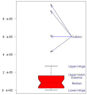
Their inclusion and display is set by the plot constants. The default plot constants include all low outliers (percentile of 0 set for the lower whisker), a lower hinge set at the point where 20 percent of the data is shown (expressed as a percentile of 0.2 in the Analysis Engine), a lower notch extreme at 0.25, median at 0.5, upper notch extreme at 0.7, upper hinge at 0.75, and all high outliers (percentile of 1.0 set for the upper whisker). If the Custom Settings check box is checked in the Box & Whiskers window, you may specify the percentiles for the plot constants. The whisker settings (Lower Whisker and Upper Whisker) plot constants determine the range of outliers to show.
The notch fraction specifies the length of the median length relative to the upper notch extreme length.
To draw the axis and any associated grid and tick marks, check the Axis check box. To disable all axis features for this axis, un-check the Axis check box.
To display only points in a plot, check only the Draw Points check box. To display lines connecting the data in a plot, check the Draw Lines check box. Check both check boxes to show points and lines simultaneously.
Draw Plot Border?, Draw Figure Border?, and Draw Page Border?
To draw plot, figure, or page borders, check the Draw check box next to the item. The plot boundaries include only the length and width of the axes, while the figure boundaries encompasses titles, axis labels, and the legend. The page boundaries extend across the entire paper size.
Check the Enable Legend? check box to make a legend appear on the plot. Un-check the check box if a legend should not be shown.
To disable all of the Margin Size property settings and allow the Analysis Engine to use the default sizing methods, do not check the Enable Margin Settings? check box. To allow a custom setting, check the Enable Margin Settings? check box.
If you check the Use Patterns? check box, each bar may be illustrated with a different fill pattern. For each box, you may choose the following properties:
Style - Choose one of six styles that will be repeated in the bar.
Width - Set the relative width of the style that will be repeated in the bar. A setting of 1.0 matches the width of the borders.
Angle - Set the tilt of the repeated lines between -90 and 90. An angle of 45 will tilt from the lower left to the upper right.
Density - Set the spacing of the repeated lines. A setting of 100 leaves no space between the lines.
To add new fill patterns, delete old ones, or rearrange the existing patterns, use the special Table Icons above the list.
When the Fixed Width? check box is checked, all of the boxes in the box plot will have similar widths. When it is not checked, the width of the boxes will be weighted based on the number of points within the data set.
The grid is a set of equally spaced lines that are drawn across the plot. Grid lines enable readers to determine data values from the plot more accurately.
Draw Grid?
To draw the grid, check the Draw Grid? check box. To turn off all grid drawing, un-check this check box.
Color
You should click the mouse pointer on the Color icon to present a dialog box that allows you to choose the color three different ways. Click on the Swatch tab to pick a color from a chart directly, click on the HSB tab to specify the hue, saturation, and brightness, or click on the RGB tab to indicate the levels of red, green, and blue to be used in the color. Click OK to pick this color, Cancel to keep the previously selected color, or Reset to change the color back to the previously selected color.
Line Style
The line style specifies the appearance of the line to use for the grid. There are seven line styles including a blank line. The default style is a solid line.
Line Width
The line width specifies the number of pixels wide each line should be. The default line width is 1.0.
Enable Grid Tick Marks? (only available for X and Y axes)
This property only works with the Log Scale enabled. Set the Grid Line Style to a blank line to see this feature. It will draw tick marks facing into the plot along the axis at each grid point. Since the grid line style is set to blank, only the ticks for the grid will appear.
Grid Tick Mark Length (only available for X and Y axes)
This property represents the relative length of the grid tick marks that are created if the Enable Grid Tick Marks? check box is checked and the Log Scale is enabled. The default size is -0.2. Positive values will draw tick marks inside the plot, and negative numbers outside the plot boundaries.
Grid Bounds
This section defines where the grid starts and stops. By default, the grid extends over the whole plot. By clicking on Increment or Divisions choices instead of Default, the grid will be drawn over just part of the axis:
Default
The default behavior is to draw the grid across the entire axis.
Increment
With the Increment method for grid spacing, an Initial Point should be specified based on the starting value for the grid. The Increment specifies the distance to the next grid line (note that increment for logarithmic scales is relative to the default). A Final Point may also be specified where the grid lines should stop. For example, to draw a grid from 1.0 to 2.0 with a grid line at each 0.1 mark, enter 1.0 for the Initial Point, 2.0 for the Final Point and 0.1 for the Increment.
Divisions
With the Divisions method of grid spacing, Initial and Final Points must be specified where the grid lines will start and stop. In addition, the number of divisions between initial and final points must also be set (as an integer). For example, to draw a grid between 1.0 and 2.0 with 10 evenly spaced divisions, enter 1.0 for the Initial point, 2.0 for the Final Point and 10 for the Divisions. Note that the logarithmic scales do not include a grid line for the Final Point.
Include Boundary Values in first/last bin
When this option is checked, values at both the lowest and highest break points are included in the plot. The option only needs to be checked in cases where custom break points have been specified and some data fall at the lowest or highest break points.
Choose Vertical to display the legend entries in one or more columns. Choose Horizontal to display the legend entries in a single row.
The legend position and size are set by specification of the placement and alignment properties:
Placement
The Legend can be placed on any of the four sides of the plot (right, left, top, or bottom). The default is the right side.
Alignment
The alignment determines the legend position within the area specified by the placement. The horizontal alignment is a number between 0 and 1.0 that describes where the vertical centerline of the legend will appear. When the Placement is set to Right (default), a 0 setting for horizontal alignment will center the legend on the right plot boundary, and a 1.0 setting will center the legend on the right figure boundary.
The vertical alignment is a number between 0 and 1.0 that describes where the horizontal centerline of the legend will appear. When the Placement is set to Right (default), a 0 setting for vertical alignment will center the legend to match the bottom of the plot boundary, and a 1.0 setting will center the legend on the top of the plot boundary.
Line styles, color, and widths
There are seven line styles including a blank line. Each may appear in different colors and widths:
Line Style
This is the pattern to use when drawing the line for each data set. There are seven available line styles.
Line Width
This is the relative width of the lines. A value of 1.0 is the default. A value of 0.5 would be half as large. A value of 2.0 would be twice as large.
Color
Click the mouse pointer on the Color icon to present a dialog box that allows you to choose the color three different ways. Click on the Swatch tab to pick a color from a chart directly, click on the HSB tab to specify the hue, saturation, and brightness, or click on the RGB tab to indicate the levels of red, green, and blue to be used in the color. Click OK to pick this color, Cancel to keep the previously selected color, or Reset to change the color back to the previously selected color.
Each data set will be illustrated with a different point style and/or line style. For each data set, you may choose the following:
Symbol - Choose the style for points by double-clicking the mouse on the current symbol and then choosing from a pulldown menu. This will only affect plots if the Draw Points check box is checked.
Size - Set the relative sizes for the points by double-clicking the mouse on the current size and then typing a new size. This will only affect plots if the Draw Points check box is checked.
Line Style - This pattern is used to draw the line for each data set. There are seven available line styles. Choose the line style by double-clicking the mouse on the current line style and then choosing from a pulldown menu. This property only affect plots if the Draw Lines check box is checked.
Width - Set the relative width of the line. A setting of 1.0 matches the width of the borders. This property only affects plots if the Draw Lines check box is checked.
Color - Double-click the mouse pointer on the Color icon to present a dialog box that allows you to choose the color three different ways. Click on the Swatch tab to pick a color from a chart directly, click on the HSB tab to specify the hue, saturation, and brightness, or click on the RGB tab to indicate the levels of red, green, and blue to be used in the color. Click OK to pick this color, Cancel to keep the previously selected color, or Reset to change the color back to the previously selected color.
To add new line type properties, delete old ones, or rearrange the existing properties, use the special Table Icons above the list.
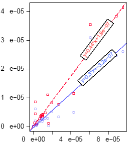
A linear regression may be added to plots to show the correlation between an independent and a dependent variable. When you select to edit the Linear Regressions, a check box and a table initially appear. Click the Enable Linear Regression check box to display the regressions. The table lists a number for the regression (the number indicates which data set in the Y values will have the regression applied), shows the words Linear Regression, and has a check box to indicate whether or not the regression should be applied. To add new linear regressions, delete old ones, or rearrange the existing boxes, use the special Table Icons above the table. The regressions that appear lowest in the list will be placed atop those higher in the list.
In addition to having the best fit linear regression displayed on the Scatter or Line Plot, statistics about the best fits may also be shown on the page showing the plot figure. In addition, four pages of statistical fit analyses will appear for each linear regression. The additional pages show a Residuals versus Fitted parameters plot, a normal Q-Q plot, a Scale-Location plot, and a Cook's Distance plot. The Analysis Engine interface does not provide a way to alter the plotting of these four pages. However, many of the items in these plots (titles, axes, data points, tick marks, etc.) will match the color set for the last regression line in the list.
After the correct number of regressions have been created with the Table Icons, double-click the mouse in the Linear Regression column on the row to be adjusted. A new dialog appears that allows you to specify all of the characteristics of the linear regression (through a dialog box with two tabs - Lines and Statistics):
Regression Line characteristics (line style, color, and width)
Residual Line characteristics (whether or not to display/enable them as well as their line style, color, and width) - note that residual lines did not yet appear on the plots at the time this manual was written
Equation Label characteristics (including whether or not the equation is displayed/enabled, text color, size, separation, significant digits, position, and background color)
The separation refers to the number of spaces that should be placed between the numbers and the equation operators in the best fit equation.
The number of significant digits refers to the digits displayed in the best fit equation.
The Position X refers to how far across the plot the equation label should be placed. A value of 0 will center the label at the left axis, and a value of 1 at the right axis.
The background color refers to the fill color for the box surrounding the best fit equation. You do not set the color for the border of this box.
Whether or not to display/enable statistics about the linear best fit beside the plot (on the Statistics tab)
Which best fit parameter results should be reported (check boxes are shown for Coefficient, PValue, Standard Error, TValue, Best Fit Equation, FStats, Residuals, or Residuals Standard Error)
Text characteristics for the Statistics parameters (including the color, size, and style)
Text Position for the Statistics parameters within the figure (location on the page)
To plot an axis using a logarithmic scale, check the Log Scale? check box. Note that this will accept only positive values. The minimum should not be set to zero when logarithmic scales are used. Note that the minimum and maximum values on the axis may be altered to fit the logarithmic scale.
Enter values here to specify the minimum and maximum properties for the axis. These values should be entered in the units of the data on the axis. When the minimum and maximum are not specified, the Analysis Engine bases them on the range of the data sets. Note that the Analysis Engine does not provide a mechanism for creating a secondary axis.
Notches can be shown on the box-and-whisker plots that indent the box at the median values. The default mode is to show no notches. If the Show Notches? check box is checked, then you may specify the Notch Fraction to determine how pronounced the notch should be.
The notch fraction can be defined as the width of the median line divided by the width of the upper notch extreme line. Therefore, a notch fraction of 0 will show no median line with both notches coming together at a point, and a notch fraction of 1.0 will appear to have no notch.
This option is only valid if the Vertical Orientation is selected for the legend. The integer specifies the number of columns of entries that appear in the Legend.
For bar and box charts, the Vertical orientation places the bars vertically, and the Category axis is the horizontal one. The Horizontal orientation sets the bars from left to right, and the numeric axis is the horizontal one.
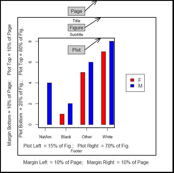
The Analysis Engine allows you to specify the dimensions of the plots, figures, and even the pages so that images can easily be used in reports and other presentation materials. You are able to set the Page Size, Figure Size, and Plot Size where the figure and plot dimensions are chosen relative to the page:
Page Size
You may specify the width and length of the page. The page size represents the entire printing area on paper or to a file. If the plot is saved in .pdf or .ps format, the units are in inches. If the plot is saved as a .jpg or .png file, the units are in pixels.
Figure Size
The figure contains the title, subtitle, plot, axis labels, legend, and footer. You may specify the figure size as a percentage of the page size or by the number of inches from the page borders.
To specify the figure size as a percentage of the page size, click the % of Page radio button. Then specify the percentages of the page length and width where the figure margins should be set. In the figure below, the Margin Left, Right, Top, and Bottom have all been set to 10.0. This means that the figure information will all be contained between 10 and 90% margins on all four sides, and any figure borders will box in this area.
To specify the figure size based on absolute distances, click the Inches radio button within the Figure Size group box in the dialog box. The Left, Right, Top, and Bottom properties then refer to the number of inches that each margin will be located from its respective side.
Plot Size
The plot represents the area where data points are displayed. You may specify the plot size as a percentage of the figure size that should be filled (relative to the lower left corner) or by the number of inches for the width and height.
To specify the plot size as a percentage of the figure size, click the % of Figure radio button. Then specify the percentages of the figure length and width where the figure margins should be set. In the figure above, the Left, Right, Top, and Bottom have been set to 15, 70, 20, and 80. This means that the plot will fill the width between 15% from the left side and 70% from the left side and also the height between 20% from the bottom and 80% from the bottom. Note that the right and top percentages are set differently for the plot size than they are for the figure size.
To specify the plot size based on absolute distances, click the Inches radio button within the Plot Size group box of the dialog box. The Width and Height within the plot size box must then be filled in to determine the plot size. The plot width and height will be used to determine how to place the plot in the center of the figure. Note that the Figure width and height must be larger than the plot width and height.
Point symbols, size, and color
There are 19 different symbols available to differentiate each data set on the plot. Select one for each data set from the drop down list in the table. To add new symbol patterns, delete old ones, or rearrange the existing properties, use the special Table Icons above the list.
The size property represents the relative size of the symbol. A value of 1.0 is the default. A value of 0.5 would be half as large. A value of 2.0 would be twice as large.
The color is specified for the points and lines of the data set. If more data sets exist than the defined symbols, then the Analysis Engine will reuse the symbols cyclically to choose symbols for the remaining data sets.
You must select either Data or Grid position methods:
Data
When you select the Data positioning button, specify X and Y coordinates to determine the text position relative to the lower left corner of the plot. These coordinates are in the same units as the data. For example, if the Y axis runs from 0 to 3e-8, then 0 would position the text beside the '0' tick mark and 3e-8 would position the text beside the '3e-8' tick mark. For non-numeric axes, the X data coordinate should range from 0 to 21 and the Y data coordinate from 0 to 18.
For text boxes, the Units may also be chosen:
Data Coordinates: Specify X and Y that the text box's center should be placed from the lower left corner of the page. The units for X and Y match those in the plot.
% of Figure: Specify X and Y as the percentages across the figure boundaries that the text box's center should be placed.
% of Page: Specify X and Y as the percentages across the page boundaries that the text box's center should be placed.
Grid
Using the Grid positioning button, enter a sector and horizontal and vertical alignment values. The sector is a set of compass values (North, South, East, West, Northeast, etc.) and a Center value. These nine sectors are within different regions for the Title, Subtitle, Footer, and Text Box:
Title and Subtitle: The sectors are at the top of the screen above the plot (top margin).
Footer: The sectors are at the bottom of the screen below the plot (bottom margin).
Text Box: The sectors are located within the specified region (plot, top margin, left margin, bottom margin, or right margin).
The horizontal and vertical alignment values may be set between 0 and 1.0 and indicate where the text should be placed within the chosen sector. For example, a horizontal alignment value of 0 in a Northwest, West, or Southwest sector would place the text to the left and be lined up with the left axis of the plot. A horizontal alignment of 1.0 would place the text to the right within its sector. For vertical alignment values, 0 indicates the lower part of the sector and 1.0 indicates the top of the sector.
Positioning Method and Axis Position
You may choose three different positioning methods to determine the location of an axis relative to the plot border:
Default - places the axis on the plot border
Lines into Margin - specifies the number of text lines to place the axis relative to the plot border. An axis position of -1 will place the axis a single line inside the plot border, and an axis position of 1 will place the axis a single line outside the plot border. When Lines into Margin is chosen, the Axis Position specifies the number of text lines that should be skipped to place the axis.
Data coordinates - specifies the coordinate of the opposing axis (using those units) where to align the axis. If the opposing axis is a Category Axis, then the coordinate should be given as a percentage (an axis coordinate of 0 will place the axis at the beginning of the opposing category axis, and an axis coordinate of 100 will place the axis at the end of the opposing category axis).
Reference lines may be placed across specified places on the plot. They may be used to indicate a trend line or upper and lower control limits in a plot. When the you click on the Reference Lines button, the Edit Reference Lines dialog box appears. It contains the Enable Ref Lines check box, a toolbar of Table Icons, and a table that initially has no entries. To show the reference lines, the Enable Ref Lines check box must be checked. Use the Table Icons toolbar to add new reference lines, delete old ones, or rearrange the existing lines. The entries at the bottom of the list will be placed atop those higher in the list.
Several properties (columns in the list) must be specified in the table for each reference line. Double click on the entries to set them:
Label
The label column defines the text box to display on the reference line. It is not required and may be left blank so that no text box appears. Double-click the mouse on the entry beneath the label column to open a dialog box specifying the text and border properties for the text box. Note that the slope of the reference line determines the text rotation, not the Rotation property on this dialog box.
Line Style
A pulldown menu will appear and allow you to select from six line styles.
Width
This property specifies the relative line width for the reference line. The default value is 1.0. A value of 0.5 will make the line half as wide. A value of 2.0 will make the line twice as wide.
Color
The displayed color will be used for the reference line. Double-click the mouse pointer on the Color icon to present a dialog box that allows you to choose the color three different ways. Click on the Swatch tab to pick a color from a chart directly, click on the HSB tab to specify the hue, saturation, and brightness, or click on the RGB tab to indicate the levels of red, green, and blue to be used in the color. Click OK to pick this color, Cancel to keep the previously selected color, or Reset to change the color back to the previously selected color.
Enable
Check the Enable check box for all reference lines that should be shown in the plot.
X1, Y1, m, X2, and Y2 (Positioning the Reference Line)
There are two ways to specify how the reference line should be positioned and how long it should be:
Slope and Point Method (creates a continuous line)
Specify a point by entering values in the x1 and y1 columns of the table. Specify a slope by entering a value in the m column. The values must use the coordinate system of the plot. This method will draw a line across the entire plot.
Use a slope of 0 to draw a horizontal line. For example, to draw a horizontal line at y = 1.0, enter '0.0' in the x1 column, '1.0' in the y1 column and '0.0' in the slope column. Type "Infinity" for the slope to draw a vertical line.
Two Points Method (creates a line segment)
This method is useful to draw a line segment between two points. Specify one point by entering values in the x1 and y1 columns. Specify the second point by entering values in the x2 and y2 columns. For example, to draw a line from (1.0, 1.0) to (4.0, 4.0), enter '1.0' in the x1 column, '1.0' in the y1 column, '4.0' in the x2 column and '4.0' in the y2 column.
By default, the box-&-whisker plots will show the first data series on the left side for the vertical orientation and at the bottom for the horizontal orientation. If the Reverse Order? check box is checked, the last data series will appear on the left side for the vertical orientation and at the bottom for the horizontal orientation.
The Rotation field provides a value in degrees by which the text will be rotated. The value may be between -180 and +180 degrees. A rotation of 0 degrees will appear horizontal, and positive values under 90 degrees will slope the text so that the beginning will be lower and to the left on the page.
The Size setting represents the relative font size to use for the text. A value of 1.0 produces the default system size. A value of 0.5 will produce text half as large, and 2.0 will produce text twice as large.
The Sorting dialog box allows you to determine the order in which to display the data:
Check Sort values? and Ascending - smallest data values will be on the left side
Check Sort values? and Descending - smallest data values will be on the right side
No check on Sort values? - data will be presented in the same order as the table rows
Missing Data (e.g., NaN entries) may appear at the beginning or the end of a sorted set. Specify Beginning or Ending.
The Space between bars field specifies a relative spacing between each bar in the plot. A size of 1.0 is the default and indicates that each space width will be equivalent to a bar with a width of 1.0. A value of 0.5 will make the space between bars half as large as a bar width of 1.0, while a value of 2.0 will set the bars twice as far apart.
In bar charts the Space between categories field specifies the relative spacing between categories (or groups of bars) on the axis. This helps to differentiate between each category. The default value is 2.0 and indicates that each space width will be double that of the default space between bars (1.0).
You must choose either Adjacent or Stacked. When multiple data sets are plotted, selecting Adjacent will place the bars beside one another. Selecting Stacked will place the bars atop one another and allow readers to determine the cumulative effect.
The Style field represents the font style (plain, bold, italic, or bold and italic) to use for the text.
The Text field shows the text string to display as a heading for the axis. Note that special characters (e.g., Greek characters, subscripts, and superscripts) cannot be displayed within the text. Click on the Edit button beside the text to open a dialog box for editing the text style, typeface, color, size, rotation, and position.
Use text boxes to present additional information on a graph that does not belong in the axes, titles, or legend. When you select to edit the Text Boxes, a table initially appears. The table lists a number for the text box, shows the associated text, and has a check box to indicate whether or not the text box should appear. To add new text boxes, delete old ones, or rearrange the existing boxes, use the special Table Icons above the list. The text boxes that appear lowest in the list will be placed atop those higher in the list.
After the correct number of text boxes have been created, double-click the mouse in the Box column on Double click to add text. A new dialog box appears that allows you to specify all of the characteristics of the text box:
Text characteristics (including the text string, style, typeface, color, size, rotation, and position)
Border characteristics (including a choice to draw the border, line style, color, and width, background color, and border padding)
The background color refers to the fill color for the text box. Click the mouse pointer on the Background Color icon to open a window that allows you to choose the color three different ways. Click on the Swatch tab to pick a color from a chart directly, click on the HSB tab to specify the hue, saturation, and brightness, or click on the RGB tab to indicate the levels of red, green, and blue to be used in the color. Click OK to pick this color, Cancel to keep the previously selected color, or Reset to change the color back to the previously selected color.
The border padding refers to the minimum amount of space between the edge of the text box and the text string. Specify the border padding on each side (Left, Right, Top, and Bottom) as widths in terms of the numbers of characters that should be skipped. The border padding values must be between 0 and 10.
Text alignment (position within the text box)
The alignment determines the text position within the text box. The horizontal alignment is a number between 0 and 1.0 that describes where the vertical center line of the text will appear. A zero setting for horizontal alignment will center the text on the left edge of the text box, and a 1.0 setting will center the text on the right edge.
The vertical alignment is a number between 0 and 1.0 that describes where the horizontal center line of the text box will appear. A zero setting for vertical alignment will center the text to match the bottom of the text box, and a 1.0 setting will center the text on the top of the text box.
Line configuration (text spacing)
Characters per Line - maximum number of characters in each line of text (default = 25)
Line Spacing - amount of vertical space between lines of text, in units of lines of text (default = 0.2)
First Line Indent - number of characters that will be indented for the first line and any lines following a line return (default = 0)
Indent for Wrapped Lines - number of characters that will be indented for lines other than the first and any lines following a line return (default = 0)
Box size (dimensions of the text box)
Box Position (location on the page)
Arrows (pointers from the text box to the plot feature of interest)
Draw Tick Marks?
Check the Draw Tick Marks?check box to display tick marks along this axis. Un-check it to turn off tick mark drawing.
Draw Tick Mark Labels?
Check this Draw Tick Mark Labels? check box to display the tick mark labels. Un-check this to disable all tick mark label features.
Color
This sets the tick mark label color; the color of the actual tick marks will match the axis color. Click the mouse pointer on the Color icon to present a dialog box that allows you to choose the color three different ways. Click on the Swatch tab to pick a color from a chart directly, click on the HSB tab to specify the hue, saturation, and brightness, or click on the RGB tab to indicate the levels of red, green, and blue to be used in the color. Click OK to pick this color, Cancel to keep the previously selected color, or Reset to change the color back to the previously selected color.
Font Style
This sets the font style for the tick mark labels (plain, bold, italic or bold/italic).
Perpendicular to Axis?
Check the Perpendicular to Axis? check box for the tick mark labels to appear perpendicular to the axis.
Size
Select the size of the tick mark labels in pixels.
Edit Custom Tick Marks (available for the Numeric, X, and Y Axes)
Custom Tick Marks allow you to specify values and labels on the axis at positions of interest. Their appearance overrides the default tick marks.
To use them, press the Edit Custom Tick Marks button to present a dialog box. On the left is a table to enter the tick mark labels. On the right is a table to specify the positions on the axis where the tick marks should be drawn. To add and delete lines on the pair of tables, use the special Table Icons above the list. The left and right tables must contain the same number of rows.
The Time Format field specifies the format in which all time values must be entered. It also represents the format that will be used in the plot itself. This field should be set before entering values in this dialog box.
Check the Transpose Data? dialog box to transpose the display of the data in bar charts. Normally the bars from a column of data are grouped together, and the legend describes the row names. When Transpose Data? is checked, the bars for a row of data will be grouped together. The axis label will reflect the row, and the legend will show the column names.
The Typeface field specifies the font to use for the text. The currently available choices are Default (similar to an Arial font), Serif, sans Serif, and Script.
By default, the X axis on a histogram ranges from the highest to the lowest bin. However, single outliers may not be of interest for histogram presentation. Therefore, you may specify the lower and upper values that should be plotted in any histogram. Note that specification of lower and upper values sets the distribution of the bins, but the minima and maxima for the axes are still set through the X and Y Axis user interfaces. This feature was not operating at the time of publication. If you wish to exclude data outliers from the histogram, use the Filter Rows function.