The U.S. EPA’s
Total Risk Integrated Methodology (TRIM) provides a modeling system for
assessing the human health and ecological risks associated with exposures to air
pollutants. It provides capabilities to model
the fate of multiple pollutants through different media types and exposure by
multiple pathways. The Carolina
Environmental Program (CEP) at the University of North Carolina
at Chapel Hill is working to integrate TRIM
within EPA’s Multimedia Integrated Modeling System (MIMS) framework. As part of this integration, CEP has designed a data analysis tool for
visualizing output data from TRIM.
The Data Analysis and Visualization Engine (DAVE) is designed
to create plots and tables using data contained in relational databases that
are generated by TRIM modules. Such
databases are currently stored using MySQL, as opposed to the ASCII files that
are also output from some modules. DAVE
can also be used to export the data into delimited text files for import into
other analysis programs. DAVE has
customized windows with content that varies based on the type of database being
analyzed. The software currently reads
the following database types:
·
Ecological Risk
·
Human Inhalation Exposure
·
Human Health Risk
·
Human Health Risk Metrics
Each database type has a unique configuration. The Human Inhalation Exposure, Human Health Risk,
and Human Health Risk Metrics databases can be based on data generated using
either of two methods: TRIM.ExpoInhalation (also known as APEX) or the
Hazardous Air Pollutant Exposure Model (HAPEM) . Once data of interest in the databases is
selected using DAVE, it is passed to the MIMS Analysis Engine for further
analysis in the form of plots and tables.
The MIMS Analysis Engine provides functionality to support the needs of
its user community and can be further customized in the future. See the documentation of the MIMS Analysis
Engine in the docs folder of the TRIM installation for further guidance on
using the features of the Analysis Engine.
DAVE can be accessed through one of two methods: (1) from within a MIMS
scenario, or (2) as a stand-alone program.
A file called rundave.bat is provided as part of the
TRIM installation package to assist you with running DAVE as a stand-alone
program. This batch file contains
references to the Java files needed to run DAVE. If TRIM has been installed through the
installer, a shortcut to rundave.bat
is added to the current user’s Start menu on Windows. Simply click Start, and then choose All
Programs, TRIM, and DAVE. This should
start DAVE if the TRIM installation was done properly.
If you have problems starting DAVE from All Programs and
need to locate the file rundave.bat,
use My Computer or the Windows explorer to browse to the “bat” folder contained
in your TRIM installation folder. To
execute the batch file, double-click on the rundave.bat
icon. If you still have problems, check
the settings in the trimvars.bat file
in the same directory and make sure they are correct for your computer. [Note: If you expect to run DAVE frequently,
you can create a shortcut on your desktop by right-clicking on the icon and
choosing Create Shortcut from the pop-up menu that appears. After the shortcut appears, you can drag it
onto your desktop and from there you can rename it, if desired.]
After starting DAVE, a DAVE Database Selector window appears
(Figure 1). The table in the window is
populated with a list of databases that are located in the data directory of
your MySQL installation (e.g., C:\mysql\data).
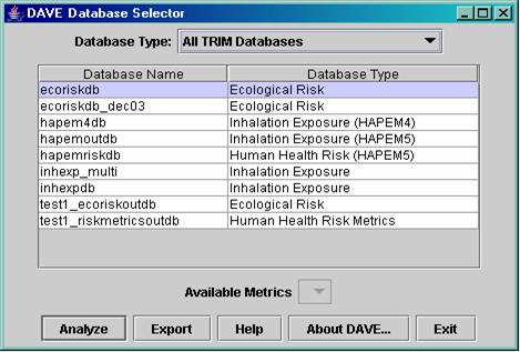
Figure 1: DAVE Database Selector window.
Only the databases that exist on your
computer and can be analyzed by DAVE are listed in the table. Therefore, you may have more databases in
your MySQL data directory than the ones shown in the DAVE Database Selector
window. Each database is of a particular
database type: Ecological Risk, Human Inhalation Exposure, Human Health Risk, or
Human Health Risk Metrics. As noted
earlier, the Human Inhalation Exposure, Human Health Risk, and Human Health
Risk Metrics databases can be generated using either TRIM.ExpoInhalation
or HAPEM; the database structure differs depending on which model was used to create it. Within DAVE, the
databases generated using the current version of HAPEM are followed by
“(HAPEM5),” and databases generated by the default TRIM.ExpoInhalation
processor are annotated by the relevant TRIM.ExpoInhalation version
(e.g. APEX3.3). DAVE also supports analysis
of inhalation exposure databases created with the previous version of HAPEM,
HAPEM4, although risk databases generated with HAPEM4 are not supported.
If you started DAVE from a MIMS
scenario, one of the databases may already be selected for you. In this case, the selected database will be
highlighted in light blue. If no
database is selected, or if you want to choose a different database, click on
the database you wish to analyze or export.
You may first want to narrow down the list of databases by selecting a
type from the “Database Type” pull-down menu.
The list will then show only databases of the chosen type (e.g., “Ecological
Risk” database names).
There is an “Available Metrics”
pull-down menu below the table of databases.
This will be enabled only if the database you have selected is a Human
Health Risk Metrics database. The menu
lists the metrics that are available in the selected database (e.g. Annualized
Cancer Risk, Annualized Non-cancer Hazard Quotient, Population-weighted Hazard
Frequency Distribution). If you are
analyzing a database of this type, choose the metric to analyze or export.
DAVE has two primary and separate functions
that can be performed on databases: analyze and export. The analyze function allows you to see what
is in a database and to select data to present in plots or tables. The export function is used to export data
from a database into a workable format that can be used by programs other than
MySQL and DAVE. Each of the database
types recognized by DAVE has a different structure. The analysis and export functions
automatically adjust to accommodate the differences in structure. If you click on the “Analyze” button, the
database selected in the table will be loaded into the DAVE Analysis window. If you click on the “Export” button, DAVE
will bring up a dialog that allows you to choose a delimiter for the data and
the location in which to place the exported file; for some types of databases,
you can also choose the parts of the database to export. Note that the export function is not
supported for Human Inhalation Exposure (APEX and HAPEM) database types at the
time of the initial release.
Aside from Analyze and Export, three
other buttons are available on the Database Selector window:
·
Clicking on the “Help” button brings up a window
that shows the DAVE User Guide.
·
The “About DAVE…” button brings up a dialog that
shows the version of DAVE you are running.
·
The “Exit” button causes DAVE to close.
The export feature in DAVE allows you to export data into a
delimited file for use within other programs (e.g., Microsoft Excel or Notepad).
After you click on the “Export” button, DAVE
will check the type of the selected database against the list of types that can
be exported. If the database is a Human
Inhalation Exposure database (APEX or HAPEM), which cannot currently be
exported, an error message will appear. For
all other database types, an Export Database
window will appear. An example is shown
in Figure 2. This window allows you to specify
the delimiter to be used to separate the values in the output file, and the
name of the output file that will contain the exported data. You can either type the path and file name directly
into the “Output File” text field or create it by clicking on the “Browse”
button, navigating to the desired directory, and typing in a name for the new
file. [Note: If you want to limit the files shown in
the browser to those with a certain extension, you can type an entry containing
a wildcard (for example, “*.txt”) into the “File Name” text field, then press
“Enter” on the keyboard.] After you have
finished typing your file name into the “File Name” text field, click on
“Accept” to return to the Export Database window.
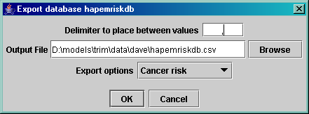
Figure 2: DAVE Export Database dialog.
By default, DAVE will create a “comma separated value,” or
.csv file. If you choose a delimiter
other than a comma, we recommend that you give the file an extension of .txt. DAVE will not automatically give the file an
extension, so you need to include an extension as part of the name you create. After you are satisfied with the name showing
in the “Output File” text field in the Export Database window, click on “OK.” If the data are exported successfully, a dialog
will appear that informs you of this and reminds you where the data are stored. If the database cannot be exported as
requested, an appropriate error dialog will appear. Note that some types of databases contain data
for multiple variables. For example,
Human Health Risk databases contain data for both cancer risk and non-cancer
hazard quotients. However, only one type
of data can be exported at a time. In
these situations, there is an additional “Export options” pull-down menu from
which you can choose the type of data to export.
Clicking on the “Analyze” button from the Database Selector
window allows you to analyze the chosen database by creating tables and plots
that show subsets of the data. [Note
that the “Analyze” button is “clicked on” automatically if you double-click on
a database in the Database Selector window.
Also note that default buttons in all of the windows are indicated by
the thicker border around them]. The “Analyze”
button is disabled for certain “Available Metrics” in the Risk Metrics
databases that cannot be analyzed with this feature currently.
The remaining sections of this manual explain the various
aspects of the analysis function. Once
you have chosen to analyze a particular database, DAVE brings up an Analysis window
similar to the one shown in Figure 3. Each
database type has a different set of variables displayed in this window; Figure
3 is an example based on the Human Health Risk (HAPEM5) database type.
The Analysis
window consists of several parts:
·
At the top are the database type and
description. Descriptions are available for
some types of databases, such as human health risk metrics; in this case the
description would provide some information about the metric being analyzed.
·
The next section of the window addresses the
dependent variables in the database. The
dependent variables are those for which there are values stored in the
database. These are the values that will
be shown on any plots and tables that are created. There can be more than one dependent variable
in a database. For example, the Human
Health Risk databases contain two dependent variables: cancer risk and
non-cancer hazard quotient.
·
The middle portion of the Analysis window shows
the independent variables available in the database. Independent variables are variables for which
different values of the dependent variables exist. The number of options available for the
independent and dependent variables are shown in parentheses next to the
variable names. For example, Figure 3
shows that in this example database there are six different source types and 18030
people with cancer risk values.
Additional cancer risk values could be stored for multiple chemicals,
start years, and counties (the remaining three independent variables), but in
this database all the data are for the same chemical, start year, and county.
·
Lists of the available types of plots and tables
are shown in the lower portion of the window.
More information on these analysis products is given later in the
document. A directory in which to place
the analysis products can be specified at the bottom of the window, either by
typing in the “Directory for output files” text field or by using the “Browse”
button to find a directory.
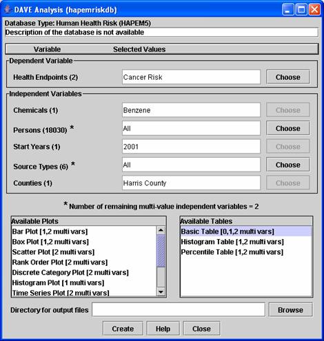
Figure 3: Example DAVE Analysis window.
To create tables
and/or plots, you must first specify the independent and dependent variables
DAVE should use to subset the data so that only the data of interest are
displayed in the plot or table. Table 1
lists all of the variables for each of the database types. The dependent variables are those for which
values will be plotted or shown in tables (e.g., cancer risk, hazard quotient);
the independent variables (e.g., chemical, start year) are the qualifying
parameters whose values are used to select the appropriate value of the
dependent variable from the database. For
example, each hazard quotient value in an ecological risk database is for a
specific ecological benchmark, chemical, receptor, volume element, and time.
Table 1: Dependent and independent
variables for each database type.
|
Database Type
|
Dependent Variables
|
Independent Variables
|
|
Ecological risk
|
Ecological risk
(e.g., hazard quotient)
|
Ecological
benchmarks, chemicals, ecological receptors, volume elements, times
|
|
Human health risk (APEX 3.3)
|
Human health endpoints (e.g., cancer
risk, non-cancer hazard quotient)
|
Chemicals, persons, start years, source
types, facilities
|
|
Human health risk (HAPEM5)
|
Human health endpoints (e.g., cancer
risk, non-cancer hazard quotient)
|
Chemicals, persons, start years, source
types, counties
|
|
Human health risk metrics (APEX3.3)
|
Specific to the metric that is being
analyzed
|
Metric specific (more detail will be
provided in a later version of this manual)
|
|
Human health risk metrics (HAPEM5)
|
Specific to the metric that is being
analyzed
|
Metric specific (more detail will be
provided in a later version of this manual)
|
|
Human inhalation exposure (APEX3.3)
|
Exposure or dose (e.g., average dose,
average exposure, maximum dose, maximum exposure)
|
Chemicals, persons, date ranges, source
types, facilities, study areas
|
|
Human inhalation
exposure (HAPEM5)
|
Exposure or dose (e.g., average exposure)
|
Chemicals, persons, counties, source
types
|
|
Human inhalation
exposure (HAPEM4)
|
Exposure or dose
(e.g., average exposure)
|
Chemicals,
demographic groups, home sectors, replicates
|
As noted above, after each variable
name in the Analysis window is a number in parentheses. This indicates the number of possible values that
you can choose from for a given variable.
Some of the variables have only one possible value; for example, in the
ecological risk database example, the dependent variable can be only hazard
quotient. Other variables have multiple
possible values, ranging from two values to thousands of values. If there is just one possible value, the “Selected
Values” text field beside the variable name will already contain that value,
and the “Choose” button will be grayed out.
If there is more than one possible value, you use the “Choose” button to
select what value you want to use in generating plots or tables.
When you click on “Choose” for a
given variable, a Select Values window opens.
It contains a list of all the possible values for that variable. At this point the procedure for dependent and
independent variables is slightly different.
- For
dependent variables, you can work with only one value at a time in the
plots and tables. Highlight the value
you want and then click on “OK” (or simply hit return). The value you highlighted will then show
up in the “Selected Values” text field beside the name of the variable in
the Analysis window.
- For
independent variables, the Select Values window includes a “Choose” pull-down
menu above the list of possible values.
This menu contains the following choices (Sorted Values also
available).
·
One –
Allows you to select one value for the variable (e.g., for an ecological risk
database, benzo(a)pyrene as the chemical, or 1987-01-03 00:00:00 as the time).
·
All –
This will cause DAVE to provide values of the dependent variable for every
value of the independent variable. For
example, for an ecological risk database, if you select “All” for Chemicals,
there will be one hazard quotient value for each chemical in the database
(e.g., benzo(a)pyrene, divalent mercury, and methylmercury).
·
One
for each – DAVE will create a table or plot for each value of the selected
independent variable (e.g., a table/plot for each chemical or for each year).
·
Maximum
– DAVE will determine the maximum
value for the dependent variable across all of the values for the given
independent variable (e.g., when using a human health risk database and using Cancer
Risk as the dependent variable, selecting Maximum for the Persons independent
variable will cause DAVE to search through all the cancer risk values for the variable
Persons and find the highest risk to any person, then use that value in the
analysis). Maximum is disabled if Sum
Over and Mean is disabled.
·
Minimum
– DAVE will determine the minimum value across all of the values for the given
independent variable (e.g., when using a human health risk database and using
“Cancer Risk” as the dependent variable, selecting Minimum for the Chemicals independent
variable will cause DAVE to search through all the cancer risk values for the variable
Chemicals and find the lowest value, then use that value in the analysis). Minimum is disabled if Sum Over and Mean is
disabled.
·
Sum Over
– DAVE will sum the values of the dependent variable across all of the values
for the given independent variable for which you have chosen “Sum over.” For example, selecting Sum Over for Chemicals
when using a human health risk (HAPEM) database and using Cancer Risk as the
dependent variable will cause DAVE to sum the cancer risk for all chemicals and
provide the results for each person for the selected year, source type, and
county.
·
Mean – Mean
value across all of the values of the given independent variable.
·
Ignore
– DAVE will ignore this variable in the analysis. For example, with an ecological risk database,
you can create a rank-order plot for a particular time and showing each
chemical separately by selecting Ignore for benchmarks, receptors, and volume
elements. All of the hazard quotient
values will appear on the plot, but the particular benchmark, receptor, and
volume element that they correspond to will be ignored.
Below the variables section of the Analysis window (Figure 3)
is a note about how many “multivalue independent variables” remain. For independent variables that have more than
one possible value (i.e., those that have a number greater than 1 in
parentheses after the variable name, such as “Source types” in the human health
risk database type), you have the option of choosing a value of “All” (as
explained in the bullet above). If you
choose “All,” you will see an asterisk appear with that variable name. This indicates that you have chosen to use all
(i.e., multiple) values of that variable in your plot or table. A variable with an asterisk is referred to as
a multivalue independent variable. The
number of multivalue independent variables is very important because it determines
what types of plots or tables you can create.
Thus, DAVE emphasizes this number by stating it in the note below the
variables section of the window.
The plots and tables that can be created by DAVE are shown
in the lists of Available Plots and Available Tables in the lower portion of
the Analysis window. Each type of
plot/table that you can select is followed by a note (e.g. “[a,b multi vars]”) indicating how many multivalue
independent variables are allowed when preparing that type of plot/table. For example, if the note says you have two multivalue
independent variables, you could create a table (two dimensional table which has
two places for independent variables, rows and columns, with the dependent
variables in each cell), or a categorized (e.g. stacked) bar plot (which also presents
two independent variables with multiple values [e.g., chemicals and receptors]). If you have only one multivalue independent
variable, you could do a simple bar plot, for instance, or a one-dimensional
table. Using zero multivalue independent
variables results in a single value that is shown in a text window (i.e., the
output of the table creation process is a single value for the dependent value). If the number of multivalue independent
variables in the note is not listed for the type of plot/table you select, an
error message will appear when you try to create the plot/table. For more information on how many multivalue
independent variables are required by each table or plot type, see Section 5 or
6, respectively.
You may specify a default directory to contain your plots
and tables using the “Directory for output files” text field near the bottom of
the Analysis window. The directory is
specified by either typing in the directory name or selecting it using the “Browse”
button. If you do not specify a
directory in this field, a default value of your TRIM directory\data\dave will
be used. You will also have a chance to
provide a specific file name (including a directory) for the plot or table in
the Customize Plot or Customize Table dialog that appears after you click on the “Create” button (unless you
chose the Single Value table, in which case there is nothing to customize).
Once the number of multivalue
independent variables matches one of the numbers allowed for the plot or table
of interest, you can begin the process of table/plot generation by clicking on
the “Create” button. If you are unsure
of the contents of the database of interest, you may want to begin by analyzing
your data with two-dimensional tables
rather than plots, so that you can see what data is in two dimensions of the
database. If there are missing data
values for some of the variable values, the tables will still be generated. Note that trying to generate certain plots using
a data set with missing values may result in an error message.
The “Help” button at the bottom of the Analysis window will
bring up the DAVE user guide in a separate window. The “Close” button will close the Analysis
window and return you to the Database Selector window or to another open
Analysis window.
In the list of available tables in the Analysis window (Figure 3), the first
item is the Basic Table. This one is
different from all of the other tables. It
can be used to extract one value from the database, and can be selected when
there are zero remaining multivalue
independent variables. The single value
is shown in a Single Value Result text window (Figure 4). From there, the value can be copied and
pasted into another application using the Control-C and Control-V keys. To close the Single Value Result text window,
click on the X in the upper right corner.
Single values are not saved to files.
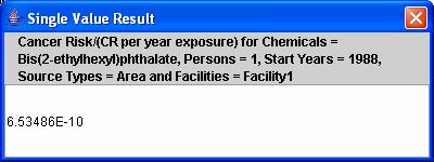
Figure 4: Single Value Result text window.
If you select any of the tables that require one or two multivalue
independent variables, a Customize Table dialog will appear after you click on
the “Create” button in the Analysis window.
An example of the Customize Table dialog for a two-dimensional table is
shown in Figure 5.
- In the first section of this dialog, you can specify
which of the remaining two multivalue independent variables will appear as
the rows in the table; the other variable will be the column headers. If you have one variable with a lot more
values than the other, the system will be faster if you specify that
variable to be the rows. Important note: If you have one
variable with thousands of values, be sure to use that variable for the
rows and not the columns, otherwise DAVE will be very slow to create the
table.
- The Text Labels section allows you to customize the
text labels that will be placed in the table.
- In the Table Configuration section, you can specify
the format of the table. The
available formats are CSV (comma-separated value), custom delimited, or
fixed width. If you choose a
custom-delimited table, you can specify a delimiter to use other than a
comma. If you choose to output a
fixed-width table, you should specify the fixed-width spacing to use for
each column. The number of
significant digits entry applies to all three table formats. If the “Show the table after creation”
checkbox is checked, the resulting table will be shown in the Sort Filter
Table application that is part of the MIMS Analysis Engine;
this application is used when you show any type of table after its
creation. Note that the Sort Filter
Table application can read CSV or custom-delimited files but not
fixed-width tables. An example of a two-dimensional
table created using DAVE is provided in Table 2.
- The file name for the table specified in the “File
Name” text field will be used. A
default unique file name will be generated, but you may change it either
by editing the value directly in the field or by browsing to the file name
using the “Browse” button.
- The table is actually created after you click the OK
at the bottom of the dialog.
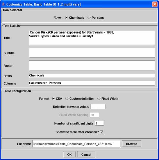
Figure 5: DAVE Customize Table dialog.
In addition to the Single Value table discussed earlier, the
types of tables DAVE can generate are the following:
- 2 Dimensional Table (requires 2 multivalue
independent variables) – This option generates a two-dimensional table
showing the values of the dependent variable as a function of two
independent variables (see Table 2 for an example). The values of one independent variable
are shown as the columns and the other as the rows. For the remaining independent variables
in the database, either a constant value is used, or a function is
computed based on the option you chose for each variable in the Analysis
window (e.g., maximum, minimum, sum over).
Table 2: Example of a fixed-width two-dimensional
table with “|” as a delimiter.
Values for Ecological Risk =
Hazard Quotient ; Eco. Benchmarks = Dose : NOAEL : Reproductive success ; Eco.
Receptors = White Tailed Deer ; Times = 1987-01-03 00:00:00
| |MethylMercury |Benzo(A)Pyrene
|SurfSoil_E1 |1.436E-10 |5.621E-10
|SurfSoil_ESE2 |8.642E-11 |3.628E-10
|SurfSoil_ESE3 |1.193E-10 |3.948E-05
|SurfSoil_N2 |1.429E-10 |5.849E-10
|SurfSoil_NE2 |9.771E-11 |4.268E-10
|SurfSoil_SE1 |8.134E-11 |1.640E-05
|SurfSoil_SSE2 |7.153E-11 |7.431E-06
|SurfSoil_SSE3 |8.693E-11 |3.393E-10
|SurfSoil_SSE4 |1.203E-10 |7.446E-07
|SurfSoil_SW2 |9.102E-11 |3.500E-10
|SurfSoil_W2 |7.507E-11 |3.122E-04
- 1 Dimensional Table (requires 1 multivalue
independent variable) – This option provides a one-dimensional table
showing the values of the dependent variable as a function of the
independent variable with multiple values, given that each of the
remaining independent variables is held constant as specified in the
Analysis window (see Table 3 for an example). This table is the same as the two-dimensional
table, except it has just a single column of data after the first column
of labels. When you select this
option, the Customize Table dialog will
appear, but you will not be able to choose whether you want the remaining multivalue variable to be columns
or rows; it will always be used for the rows.
Table 3: Example of a one-dimensional table.
"
Maximum Values Across Persons/(CR per year exposure) for Chemicals =
Benzene; Start Years = 2001; Counties = Harris County;"
"Source
Types","Cancer Risk"
"BackgConc","3.7652E-08"
"SOURCE1","1.0561E-06"
"SOURCE2","5.9269E-08"
"SOURCE3","3.2136E-06"
"SOURCE4","1.5578E-08"
"Total
Outdoor","3.3914E-06"
·
Histogram Tables: This type of table is available
for either one or two multivalue independent variables. It is used to present counts of how many
times the value of a dependent variable falls within a particular range or bin. After you enter information as needed into
the Customize Table dialog and then click on “OK,” a Customize Histogram dialog appears; an example is shown in
Figure 6. In this dialog, you can specify whether the histogram
table shows the frequency (i.e., a count), the percentage, or the probability
(values between zero and one). You can
also specify the bins to use.
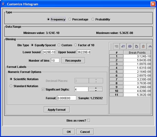
Figure 6: The Customize
Histogram dialog.
Some configuration options are provided to make
it easy to choose the bins:
o For equally spaced bins,
select the Equally Spaced option, specify the lower bound, upper bound, and
number of bins, then click on the “Recompute” button. The bins are computed using the minimum and
maximum values of the data range. The
resulting bin break points are shown in the break points table on the right
side of the window.
o For bins that differ by
a factor of 10, select the Factor of 10 option, specify the lower bound and the
number of bins, then click on the “Recompute” button. The resulting bin break points are shown in
the break points table.
o For totally customized
bins, select the Custom option and edit the values of the bins in the break
points table. The buttons in the toolbar
above this table can be used to insert or delete values, and you may edit the
values in the break points table directly by double-clicking on a specific
value.
You may customize the format of the bin labels
by adjusting the items in the Format Labels section and then clicking on Apply
Format. If you would like to see the
bins as the rows instead of the columns
(the default), activate the “Bins as Rows?” checkbox (caution: do not use this checkbox if your independent variable has thousands
of values). An example of a
histogram table for two multivalue independent variables (person and source
type) is shown in Figure 7. The software
displaying the table is the MIMS Analysis Engine Sort Filter Table application.
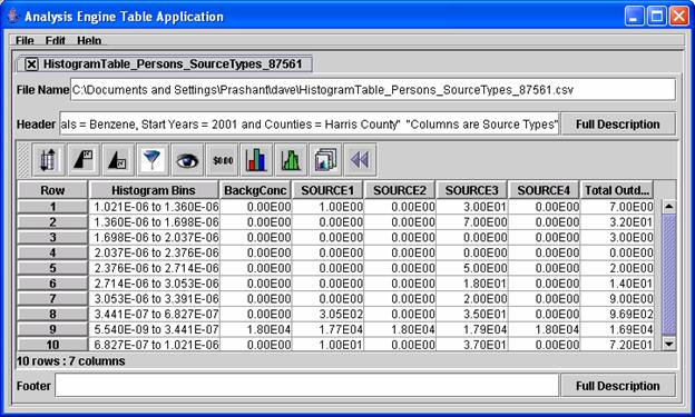
Figure 7: An example histogram table for two multivalue
independent variables.
·
Percentile Tables: These tables are
available for either one or two multivalue independent variables. The percentile tables are similar to the
histograms, but you specify percentiles to compute instead of a list of bin
cutoffs. When a percentile table is
requested, a Customize Percentiles dialog (see the example in Figure 8) will
appear after you click on “OK” in the Customize Table dialog. This Customize Percentiles dialog is used to
specify the percentiles to compute. Some
preconfigured options are available via the Quartiles (every 0.25), Quintiles
(every 0.2), and Deciles (every 0.1) options at the top of the dialog. After choosing one of these, you can then add
additional percentiles if desired by specifying a minimum percentile, maximum
percentile, and step size and then clicking on the “Add Percentiles” button. You may also add or remove specific
percentiles by using the buttons on the toolbar in the Percentiles section. If you wish for the percentiles to appear as
rows instead of columns (the default), activate the “Percentiles as rows?”
checkbox. Caution: Do not activate Percentiles as rows if your independent
variable has thousands of values – a table with thousands of columns will result
and it will be very slow. An example
of a Percentiles table for two multivalue independent variables (person and
source type) is shown in Table 4. This
table was created from a CSV file that was output by DAVE
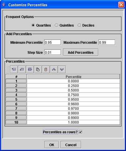
Figure 8:
Percentile Editor dialog.
Table 4: An example percentiles
table for two multivalue independent variables.
|
Percentile of Cancer Risk/(CR per year exposure) for Chemicals =
Benzene; Start Years = 2001; Counties = Harris County;
|
|
Percentile
|
BackgConc
|
SOURCE1
|
SOURCE2
|
SOURCE3
|
SOURCE4
|
Total Outdoor
|
|
0.0 %
|
1.0435E-08
|
4.0783E-08
|
1.1756E-08
|
1.7405E-08
|
5.5402E-09
|
1.1244E-07
|
|
25.0 %
|
1.8297E-08
|
8.3460E-08
|
2.3411E-08
|
2.7434E-08
|
7.7476E-09
|
1.7690E-07
|
|
50.0 %
|
1.9623E-08
|
1.0316E-07
|
2.9328E-08
|
3.2955E-08
|
8.4273E-09
|
2.0450E-07
|
|
75.0 %
|
2.1361E-08
|
1.3371E-07
|
3.5980E-08
|
4.3658E-08
|
9.5316E-09
|
2.3981E-07
|
|
95.0 %
|
2.3277E-08
|
2.3199E-07
|
4.3702E-08
|
9.0932E-08
|
1.1889E-08
|
3.6987E-07
|
|
96.0 %
|
2.3478E-08
|
2.5443E-07
|
4.4525E-08
|
1.0346E-07
|
1.2224E-08
|
3.9605E-07
|
|
97.0 %
|
2.3690E-08
|
2.9084E-07
|
4.5553E-08
|
1.2302E-07
|
1.2591E-08
|
4.2457E-07
|
|
98.0 %
|
2.3991E-08
|
3.3263E-07
|
4.6989E-08
|
1.4265E-07
|
1.2981E-08
|
4.8406E-07
|
|
99.0 %
|
2.4489E-08
|
4.0807E-07
|
4.8847E-08
|
2.4358E-07
|
1.3795E-08
|
6.1130E-07
|
NOTE: As indicated at the end of Section 4, if you are
unsure of the contents of the chosen database you may want to begin by
analyzing your data using two-dimensional tables (as described in Section 5) rather
than plots. If there are missing data
values for some of the variable values, tables can still be generated.
DAVE can create a variety of plot
types using the data in the databases by passing the selected data to the MIMS
Analysis Engine and having it create the plots.
After specifying the values for the dependent and independent variables
in the Analysis window (Figure 3), you can choose the type of plot you wish to
create from the Available Plots list located at the lower left of the Analysis
window. If you wish to specify a default
directory in which to place the plots generated during your analysis, use the
“Directory for output files” text field, as explained in Section 4. After you click on the “Create” button, a Customize
Plot dialog appears (see example in
Figure 9); this is similar to the Customize Table dialog shown in Figure 5. The Customize Plot dialog allows you to
customize some of the items that will appear on your plot.
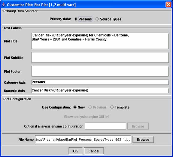
Figure 9: DAVE Customize Plot dialog.
- At
the top of the dialog is the Primary Data Selector section. This allows you to specify which of your
remaining multivalue
independent variables will be the organizing basis for the data sets
passed to the MIMS Analysis Engine for plotting. The other independent variable will be
used to specify the values contained in the data sets. For example, if your multivalue independent
variables are chemicals and source types, and you choose chemicals as the
primary data, then one data set for each chemical will be passed to the
analysis engine, and each of these data sets will contain values for all
source types. The way you “slice”
the data affects how you can present them in plots. The best way to understand how this
works is through trial and error. If
you find that a plot you create is not showing the right variable, come
back to the Customize Plot window and select the other variable as your primary
data.
- The
Text Labels section of this window is especially useful if you are
generating multiple plots using the “One for each” feature for one of the
variables. If you are not using the
“One for each” feature, you can wait and customize your labels within the Analysis
Engine window that will appear after you click on “OK” in the Customize
Plot window.
- In
the Plot Configuration section, you choose whether to use a new
configuration or an existing template.
Templates are created from the MIMS Analysis Engine plot window
that you will move to after leaving the DAVE Customize Plot window; their
creation is discussed below. You
can specify that a template should be used by choosing the Template option
and then either browsing to a template file or entering the name in the “Optional
analysis engine configuration” text field.
If you do not have a template saved, you can either create a new
configuration using the New option (the default) in this section of the
window, or you can select the Previous option to use the configuration
that was created and saved automatically by DAVE when you created your
most recent plot.
- If the
“show analysis engine GUI” checkbox is activated, the GUI will appear and
allow you to customize the plot. If
it is not activated, the plot(s) will be generated behind the scenes using
the specified template.
- You
can specify the name to be used for the plot file in the “File Name” text
field, or you can specify it later in the Analysis Engine plot window.
The data are passed to the MIMS Analysis
Engine after you click on “OK” in the Customize Plot window. In the analysis engine GUI, you can further
sub-select which data to show on a specific plot. You can also customize the analysis options
for the plot, such as the plot title, axes labels, format of bars (e.g.,
color), how to output the plot (either to the screen or saved as an image), and
the name of the file to be saved. The
remainder of this section uses the example of creating a bar plot. We use Figure 10, a MIMS Analysis Engine
example window for specifying the plot options needed to create bar plots, to
illustrate this process in greater detail.
Figure
10: MIMS Analysis Engine bar plot window.
The first item you encounter in this
window is a File pull-down menu. After
you have customized the features of a plot from this MIMS window (as described
below), you can save those customizations as a “plot template” that you can use
later to create plots that look similar.
A template can be saved by choosing “Save plot Template” from the File
pull-down menu. Templates are accessed
via the Customize Plot window, as already discussed in the description of
Figure 9.
Before creating a plot, you must
specify which data to plot. Each type of
plot requires different types of data series.
For example, a scatter plot requires an X data series and a Y data
series. A bar plot requires a “Bar Data
Series.” The data series required for
the particular type of plot are listed in the Data Sets section of the MIMS
window. Note that the notation “1 to N
needed” in this section means that the plot requires at least one data series,
but can take any number (“N”) of them. For
plots that allow only a single data series, the notation would be “1 needed.” To select the data sets to use in the bar
plot, click on the “Set” button for the Bar Data Series option in the MIMS
window. A Select Data Sets window
(Figure 11) appears that lists the data sets available to be plotted. The contents of the Select Data Sets window
are influenced by the variable you chose as the “primary data” in the Customize
Plot window. As explained earlier, when
DAVE passes the data to the MIMS Analysis Engine, it provides them in terms of data
sets organized by the independent variable you chose as primary. In the process that led to the example window
in Figure 11, Source Type was chosen as primary and the other variable was Persons.
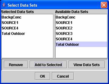
Figure
11: Select Data Sets window for choosing what data set(s) to plot.
To select a data set from the
Available Data Sets list on the right, highlight the data set and click “Add to
Selected.” The data set will now be listed in the Selected Data Sets list on
the left. To remove a data set from the
Selected Data Sets list, highlight the data set and click “Remove.” You can
also view the data in the data sets in a separate window at any time by
highlighting one or more data sets (hold down the Control or Shift key to
choose more than one at a time) and clicking “View Data Sets.” Note
that many types of plots will not be able to effectively show more than 10 or
20 datasets at one time. In addition,
tests have shown that selecting more than 30 datasets sometimes creates
problems with the R program. Selecting
fewer dataset will create clearer, more effective plots. Once you are satisfied with
the list of data sets you have selected, click “OK.” Those data sets will now be associated with
the Bar Data Series option in the MIMS Analysis Engine bar plot window (Figure 10)
and the number of data sets you
chose will now be listed beside the Bar Data Series option. To exit the Select Data Sets window without
adding any data sets or changing the list of selected data sets, click “Cancel”
and the window will close and return to the MIMS Analysis Engine bar plot window.
The section of the bar plot window
below the Data sets section is the Bar Plot Options section. You use this section to customize the plot’s
analysis options, such as the title text and its font, size, and color, the
orientation and color of the bars, and so on.
Click on the “Edit” buttons to access dialogs that allow you to perform
the customization by setting specific properties of each option. For more detail on the specifics of the user
interface for each analysis option, please see the MIMS Analysis Engine user
guide (available in the docs folder of the TRIM installation). The analysis options that are presented in
the MIMS Analysis Engine window vary slightly by plot type, but title,
subtitle, and footer are available for all types of plots.
Once you have configured the plot,
you can view a temporary copy of it by clicking on the “View Plot” button. On Windows machines, Adobe Acrobat will be
used to display the plot. The first time
a plot is created, it takes a short while to open and configure Acrobat. If you are creating multiple plots, it is
best to leave Acrobat running in the background to shorten the time required to
load the additional plots. You may want
to configure Acrobat to show an entire plot on the screen by setting the
Preference for Display to “Fit in
Window.” The location of this option varies according to the Acrobat version,
but in Version 5 you access it by choosing Preferences → General from the
Edit pull-down menu, then clicking on Display and setting Default Zoom to “Fit
in Window.”
You can save a copy of the plot by
specifying a file name in the “File Name” text field that has one of these
standard image file extensions: .jpg, .ps, .ptx, .png, or .pdf; this name will
be passed to the Analysis Engine from DAVE.
You can use the default file name chosen by DAVE, or edit the file name either
by typing directly into the File Name field or using the “Browse” button to
specify one.
A brief explanation of each plot type
available in DAVE is provided below; this list is followed by an example of
each plot type. For additional
information on the plotting options, consult the MIMS Analysis Engine user
guide.
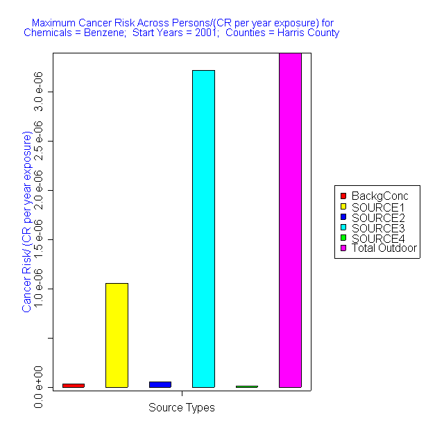
- Simple bar plot (Figure 12) (with
1 multivalue independent variable) – Plots the values of the dependent
variable for all values of one independent variable (e.g., source type)
given that all other independent variables are held constant.
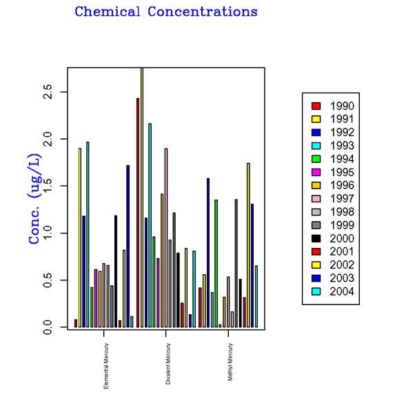
- Categorized bar
plot (Figure 13) (with 2 multivalue independent variables) – This is a
stacked bar plot showing data from various data sets (e.g., a series of
data sets consisting of one data set per chemical grouped by category (on
the x-axis).
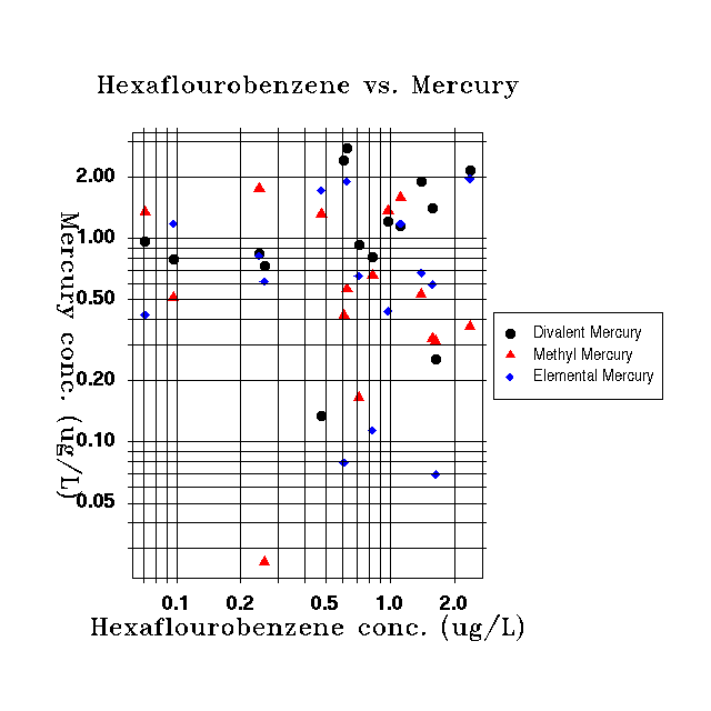
- Simple scatter
plot (Figure 14) (with with 2 multivalue independent variables) –
Plots the values of one subset of a dependent variable against another. For example, plots the relationship
between the risk for one chemical against another to see if there is a
correlation of values for the two chemicals.
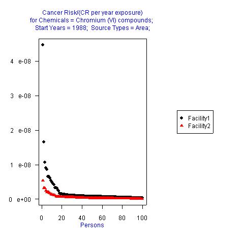
- Rank-order
plot (Figure 15) (with 2 multivalue independent variables) – Plots the values of the dependent
variable using subsets based on two independent variables on a ranked
scale, where the values for each variable are ordered by value and
measured on an equal-interval scale.
It provides an analysis of how the values of the dependent variable
are ranked relative to multiple independent variables.
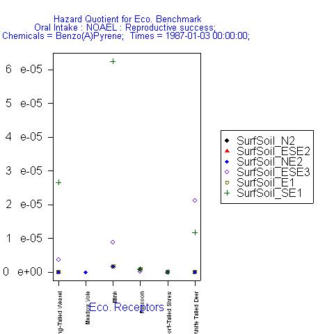
- Discrete-category
plot (Figure 16) (with 2 multivalue independent variables) – Has a
discrete categorical x-axis like
a bar plot, and plots the values of the dependent variable as multiple
symbols above each tick mark. For example,
plots hazard quotients for each source type (on the x-axis) and each chemical (as different symbols).
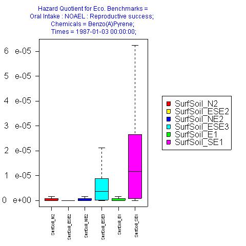
- Box plot
(Figure 17) (with 2 multivalue independent variables) – Plots the values of quartiles for
the dependent variable with a box at the 25th and 75th
variables and whiskers to the 0th and 100th
percentiles.
- CDF plot (supports
2 multivalue independent variables) – Plots a cumulative distribution
function (CDF) curve for each value of the dependent variable.
- Tornado plot
(supports 2 multivalue independent variables) – Plots a flipped bar plot
with values for the dependent variable along the x axis.
- Time Series
plot (supports 2 multivalue independent variables, out of which one
represents time) – Plots the time variable along the x axis and the
dependent variable along the y axis similar to a line plot.
- Histogram plot
(supports 1 multivalue independent variable) – Plots frequency of
dependent variables’ values in each of the histogram bins (bins are
specified by the user).
- Percentile
plot (supports 2 multivalue independent variables) – Plots the percentitles
specified by the user for each of the dependent variables’.
Figure
12: Simple bar plot from DAVE.
Figure
13: Categorized bar plot from DAVE.
Figure
14: Scatter plot example from DAVE.
Figure
15: Rank-order plot from DAVE.
Figure
16: Discrete-category plot from DAVE.
Figure
17: Box plot from DAVE.